Based on natural colors, the earth tone palette is a trend that brings warmth, especially in autumn and winter.
One of the tonal bases most loved by fashion in the autumn and winter period is also one of the most used in interior decoration and architecture: the earthy tones.
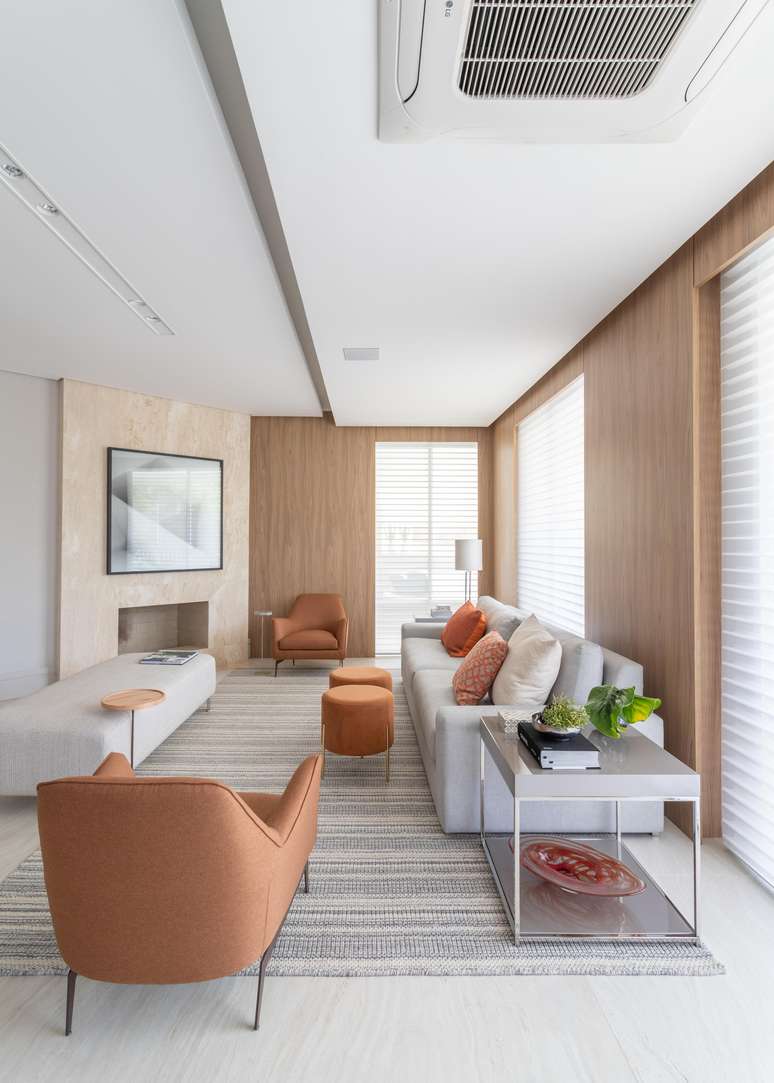
As the name itself explains, the palette comes from its earthy, like colouring reds, burnt pinks, oranges, grayish browns and sands among many others. They are trendy in the colors of the year 2023.
The gradient is varied, as is its application in decor, and can be in wall hangings, furniture, decorative pieces, upholstery, and trim.
for the architect Patricia Pennahead of the Architecture & Design studio that bears his name, the potential of the tones lies not only in their affinity with interior design, but also in the sensory connection and atmosphere they help to create.

“These colors are related to nature,” the architect points out. “Then, they connect with the experience that looking at nature transmits to us, such as welcome, peace, serenity, introspection and so on”, characterizes the professional.

At a time when people try to tune into the principles of a lighter life, in environments where it is possible to decompress the gaze from screens and the speed of technology, earth tones go beyond a seasonal trend: they exalt themselves as a palette that welcomes transforming a property into a real home.
What do earth tones convey?

By adding these nuances, the interior decor exudes cosiness and gains strength to express even more the personality of the residents, as the tones are able to evoke the perceptions they want. According to Patricia, the palette is always a consistent and well-chosen decision when it comes to living rooms and living rooms, as the sensoriality of colors conveys the coziness characteristic of warm and natural colors.
![]()
Despite their successful use in living environments, another benefit of using earth tones in architecture is the ability to work in the most varied rooms of a project, being an extremely versatile palette.
“They work well in any environment, as long as they are in harmony with the proposal”, explains the architect. “Bedrooms and living rooms are super cozy and a kitchen has a very current look,” completes the professional.

Therefore, the tone compositions are indicated for the most diverse spaces such as home offices, dining rooms and bedrooms. Discover, below, several applications promoted by the architect Patricia Penna with this chromatic base and let yourself be inspired!
How to combine earth tones

In this context of versatility, earthy tones emerge as great choices, being a fertile support for working with different layers, both in upholstery and furniture. However, for better use of colors, a studio is needed, as indicated by Patricia.
“A application of the chromatic scale it is essential. From it one should analyze what the basic tones of the paints are, assessing whether they are opposite, complementary, analogous and so on”.

In social settings, for example, warm colors in more earthy tones, such as yellow and brownthey promote serenity and comfort, being ideal for relaxation and moments of socialization and decompression.

As for private environments, such as bedrooms, earth tones convey the tranquility necessary for moments of rest, without neglecting the well-executed chromatic work in this style of room.
Source: Terra
Ben Stock is a lifestyle journalist and author at Gossipify. He writes about topics such as health, wellness, travel, food and home decor. He provides practical advice and inspiration to improve well-being, keeps readers up to date with latest lifestyle news and trends, known for his engaging writing style, in-depth analysis and unique perspectives.


