Don’t be shy when choosing your color palette
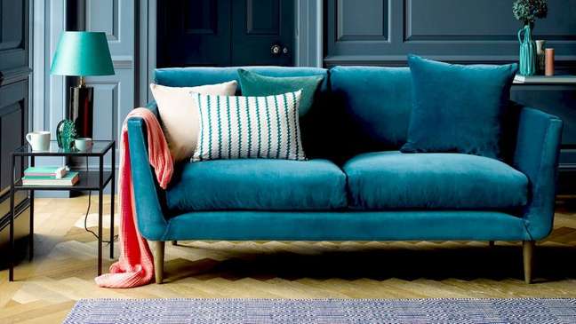
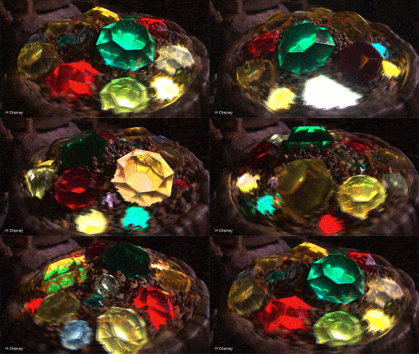
Rich, lively and bold, the jewel tones they are sumptuous colors that add a dose of drama to any room. They are so called because they derive from the tones of precious stones such as rubies, emeralds, sapphires, amethyst and more.
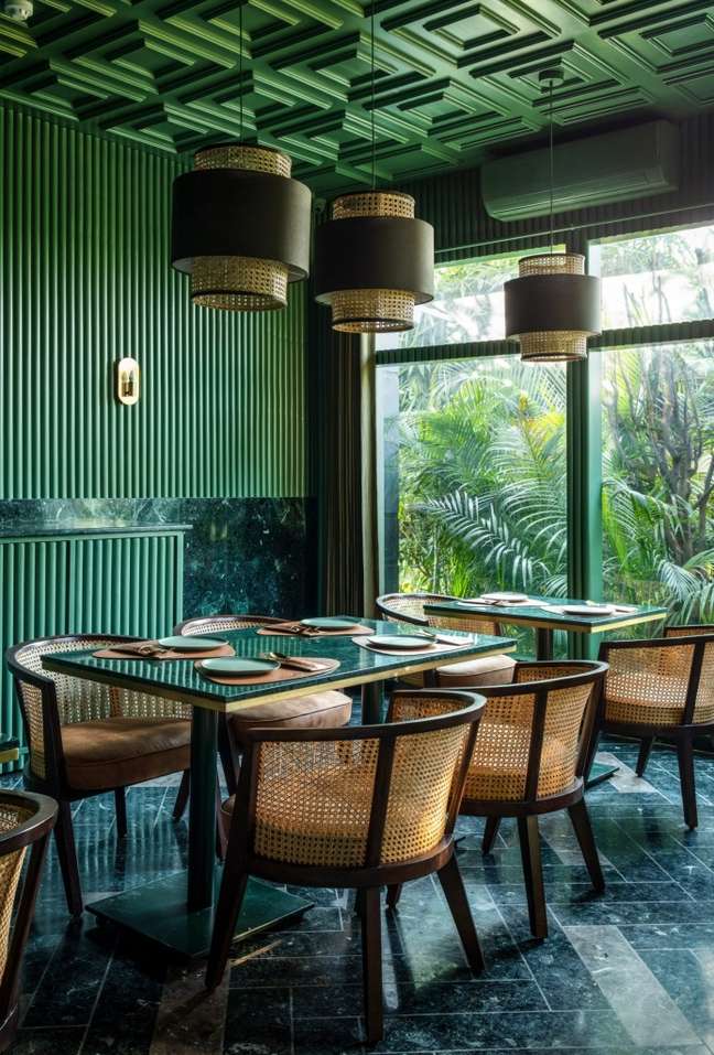
When used in a curated color palette, they add luxury to any space. These saturated colors are for those who gravitate towards deeper and darker palettes and who don’t mind taking chances when it comes to accessories, paints and furniture. In short, a jewel-toned color palette is the exact opposite of neutral or muted.
Not sure where to start creating the jewel-toned space of your dreams? We select interior designers who incorporate these gemstone-inspired colors.
From bright yellows and purples to saturated blues and greens, these artistic combinations look elevated in any room in your home.
1. Emerald green and yellow
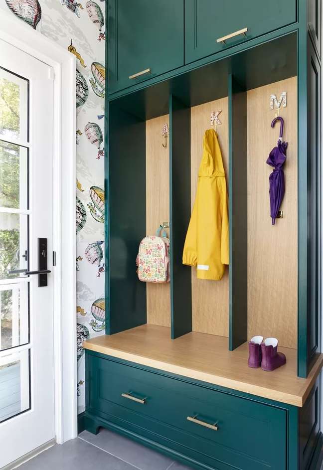
Our Brazilian classic is an impressive pair. Especially when used in jewel tones, mustard yellow or traditional yellow adds sparkle, while emerald green adds sophistication and depth.
“I love using jewel tones in small spaces like entryways or small home offices,” says Malka Helft of Think Chic Interiors. “These smaller spaces can better manage the depth and richness of a jewel tone – and highlight bold design. My favorite is emerald green combined with natural wood and a splash of yellow.”
2. Sapphire, turquoise and gray
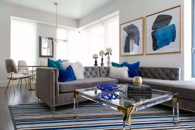
Sapphire and turquoise create a rich ocean-like palette when combined. Here, some strategically placed accessories such as velvet pillows, wall decorations and a graphic rug recall the vibrant shades of blue. Consider keeping the rest of your decor more neutral, but still on the cooler side, to really make it shine.
According to Amy Studebaker, owner and lead designer of Amy Studebaker Design, some jewel-toned accessories can form a palette like this.
“By incorporating jewel tones like this into your home, you don’t necessarily have to paint the entire room,” he says. “Adding a fun touch of jewel tone to a neutral space can already have a big impact.”
3. Navy blue and amethyst
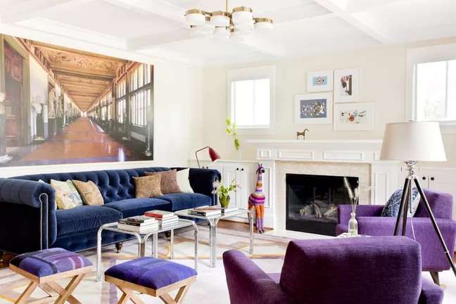
Don’t be afraid of royal purple or amethyst. Purple and navy blue create an opulent color palette that looks refined and inviting.
According to Alessandra Wood, Modsy’s Vice President of Style, “Purple is a great base color for your jewel tones, including sapphire or navy.” For deep purple hues, Wood also suggests pairing them with golden yellows to create “a very dramatic and real look”.
4. Jade and citrine
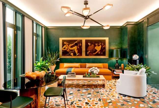
Cozy and charming, yet resolutely sophisticated, moss green jade and pale yellow-citrine orange create an almost autumnal palette inspired by beautiful gemstones.
“This is a very rich color scheme, so it’s important to use it in rooms with high ceilings and wide walls,” says interior designer and owner of The Knobs Company, David Mason. It’s a more dramatic play on classic earth tones, the darker green creates depth while the orange yellow adds warmth to the space.
Start by incorporating citrine into an emerald palette through soft products like pillows and rugs.
5. Peacock blue and emerald green
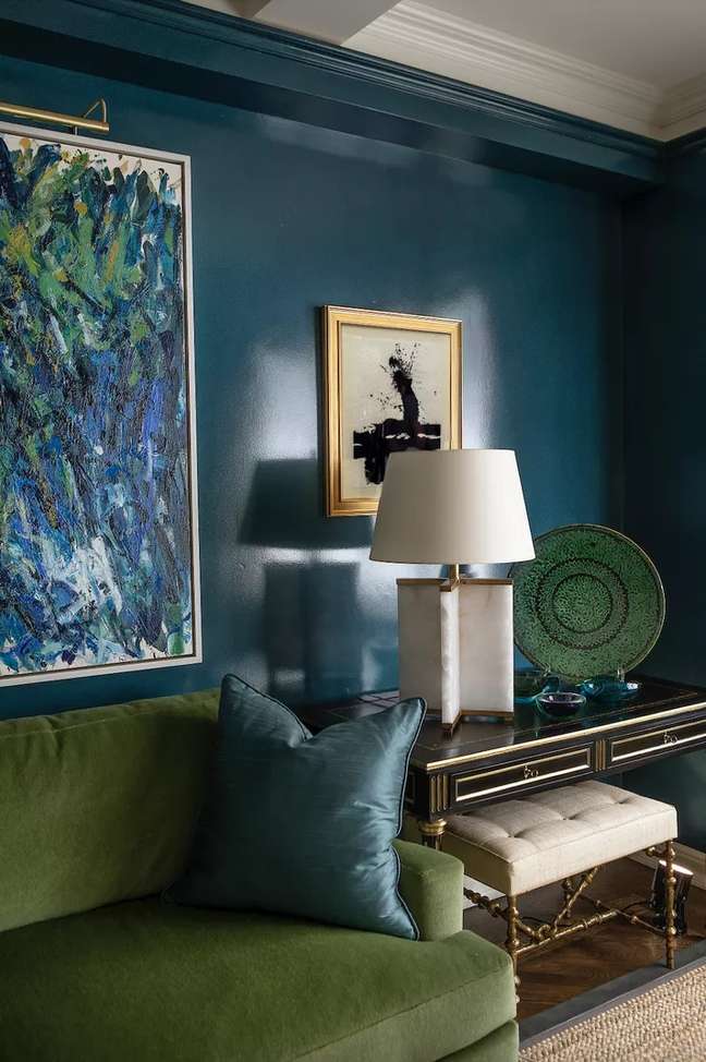
“I think rich tones, like this peacock blue, in a smaller living room can work wonders in terms of making the room feel like a small jewelry box,” says designer Mark Manardo of Perlmutter & Freiwald.
Her biggest advice when selecting a jewel-toned color palette is not to be afraid to choose a bolder color. According to him, it adds instant personality and interest and will help anchor the rest of the room.
“By painting the entire room this color can work in more compact spaces. Otherwise, for a larger space, I would consider an accent wall or partial room painting, depending on the architecture and structure of the room. It does. miracles in terms of separating the space from the rest of the house and giving life to a design vision. “
6. Jade, magenta and cerulean blue
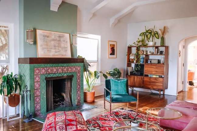
“My favorite jewel color scheme currently is jade, magenta and cerulean blue,” says interior designer Marco Bizzley of House Grail. When you incorporate it into a room, the advice is to be daring.
Pillows, paintings, an animated rug, or paint an accent wall to get all the colors there – you’ll be amazed at how well they work together. As seen in this room, this is a palette that has a lot of contrast and visual interest.
7. Garnet and Sapphire
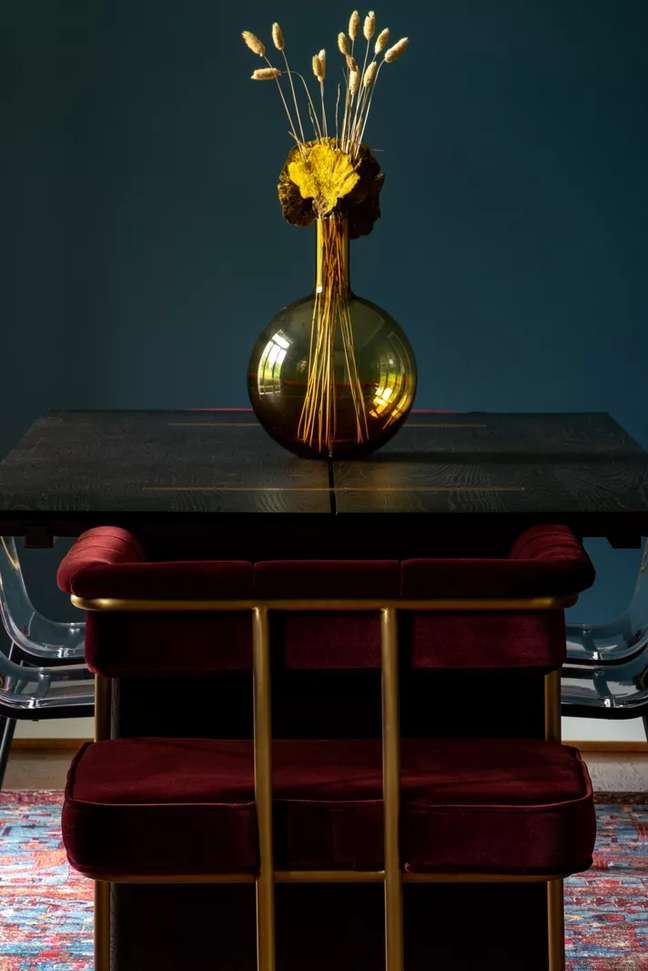
For a romantic and melancholy touch, try a deep ruby red or garnet paired with sapphire, as did Lauren Harmon of JL Design in Nashville in this beautiful dining area.
According to her, “These jewel tones really shine in a duller dining room. Using a multi-colored Ishak rug is a great way to incorporate more hues into your room. This rug was the perfect addition to upholster sapphire walls, garnet armchairs. and topaz vase. “
8. Mustard and navy blue
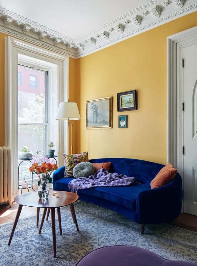
Another color combination that Studebaker is a fan of is rich mustard and navy blue. As complementary colors, he loves “how this jewel-toned color scheme adds so much richness and depth to a space.”
If you’re not sure where to start, Studebaker suggests making a statement with a jewel-toned sofa and using it as a focal point. From there, you can select a paint color and accessories.
“Repeating a jewel tone throughout your space can also help create a welcoming atmosphere for your home,” says Studebaker. “For example, you could use a rich and beautiful wall color of navy blue and accent the room with accents of the same color with rugs, accessories and pillows.”
9. Periwinkle green, aqua green and sea foam
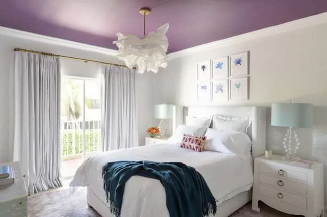
“We love Pantone’s color of the year for 2022, ‘Very Peri’ (a gorgeous teal purple) ideally paired with teal and navy green,” says designer Nina Grauer of Dekay & Tate. She loves to wear a jewel tone unexpectedly, like on the ceiling.
“It immediately draws attention and makes the room large but still intimate and welcoming. Coupled with other jewel tones and more muted jewel tones, the overall feel is rich and soft at the same time, perfect for a bedroom or bathroom”, he claims. .
* Via my domain
Source: Terra
Benjamin Smith is a fashion journalist and author at Gossipify, known for his coverage of the latest fashion trends and industry insights. He writes about clothing, shoes, accessories, and runway shows, providing in-depth analysis and unique perspectives. He’s respected for his ability to spot emerging designers and trends, and for providing practical fashion advice to readers.


