Find out how to combine these shades in an elegant and creative way
When it comes to renovating your home, most people are afraid of making major changes to the decor. This is almost always reflected in lighter or neutral toned elements in the spaces so that the result is satisfactory and error-free. However, it is possible to dare a little more and invest in a furniture happier.
To help those who are afraid of opting for a warm palette, Cerâmica Atlas, a leader in the production of small-format porcelain stoneware and stoneware ceramics, presents ideas for stylish environments. Check it out below!
1. Warm colors that give a feeling of warmth
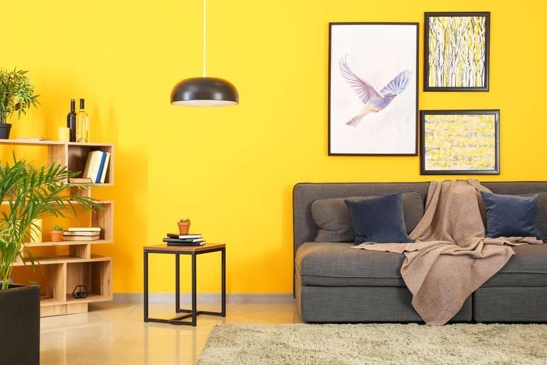
Red, yellow and orange are colors that give sensations of warmth, vitality and relaxation. However, its use requires a little attention so that the environment Don’t be too colorful or full of information.
In this case it is possible to combine more neutral furniture and brighter coverings or even patterned pieces, which mix light and dark tones. There is no default right or wrong rule. The important thing is that residents feel good!
2. Personalization with colored details
For those who simply want to include some colorful detail on the walls or floor, a custom design can be created through customization. Those who buy tablets in specialized boutiques will notice that they are equipped with glue points, such as the Drop-System, forming plates, which speed up installation. on the floors and walls.
Personalization therefore consists in “dismantling” this plate, after the well-defined project, and removing the tablets for craftsmanship, into which they will be inserted one by one until a specific design is formed. For the result to be perfect, the ideal is to look for professionals specialized in this type of service.

3. Red or burgundy furniture
The range of possibilities that red can offer impresses many who are not used to dealing with this shade in their lives. decoration. Residents and visitors will be able to appreciate the impact that this colour, as well as its variations, is capable of creating on the environment. You can combine it with other colors of tiles and coverings or choose a room (or a corner of it) to make it stand out more and attract all eyes.
4. Pay attention to the lighting
Lighting is a fundamental aspect in the perception of colors in a decorative environment. It can be manipulated to enhance or soften warm tones. Bulbs with lower color temperatures, which emit a yellowish light, tend to bring out these hues, while direct lighting creates dramatic shadows and highlights.
Diffused or indirect light, on the other hand, softens the warm tones, creating a more welcoming atmosphere. Experiment with different types of bulbs and light arrangements in the space, adjusting them as needed to find the ideal balance.
5. The size of the space makes a difference
When considering the size of the space when using warm colors in decoration, it is important to adapt the intensity and saturation of these colors according to the size of the room. In small spaces, lighter shades of warm colors, such as pastels or softer shades, are preferable to avoid a feeling of visual oppression. These tones help create the illusion of a larger, airier space, while adding warmth and vitality to the decor.
In large spaces you have more freedom to dare with more intense and saturated tones of warm colors, creating an engaging and welcoming atmosphere. However, even in larger spaces, it is important not to overload the room with too bright colors, as this could create a feeling of visual agitation.
By Danilo Costa AND Edicase writing
Source: Terra
Ben Stock is a lifestyle journalist and author at Gossipify. He writes about topics such as health, wellness, travel, food and home decor. He provides practical advice and inspiration to improve well-being, keeps readers up to date with latest lifestyle news and trends, known for his engaging writing style, in-depth analysis and unique perspectives.


