Having a colorful palette guarantees aesthetics and positive sensations
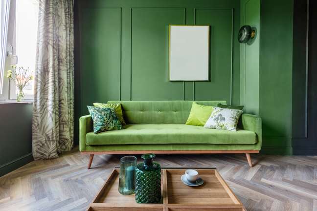
When it comes to furnishing a home, there are several ways to stage creativity and redesign environments, whether with furniture, objects or paintings on the walls. But, in this universe of possibilities, the choice of colors goes beyond the aesthetic question.
in the study of chromotherapya practice that uses the light of colors to cure some diseases, each color has a function.
Placed in the right proportion, they can bring numerous benefits to mental and physical health – such as increased disposition, reduction of sleep disturbances, relief from symptoms of certain diseases, activation of the central nervous system, improvement of headaches and blood circulation.
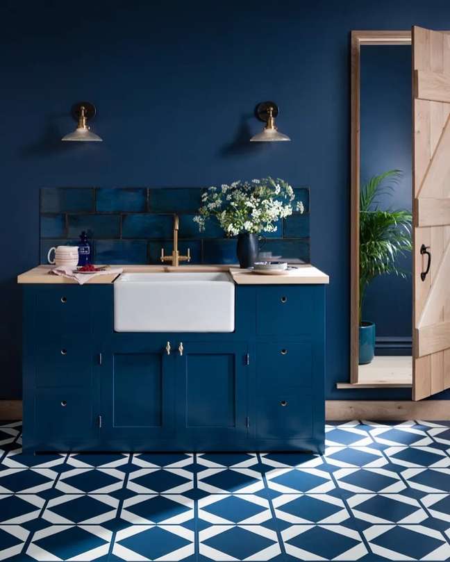
The studio has made progress and achieved architecture, in particular interior decoration, and now allows, in a project, local professionals to apply tones that directly affect the physical and emotional well-being of the residents.
According to Cristina Cardoso, architect of Yticon’s decorated apartments and builder of Grupo A. Yoshii, there is a lot of knowledge about the performance of colors in the human brain, which can sharpen the senses (with vibrant and provocative tones) or convey feelings of comfort and tranquility. (with softer and warmer tones).

It details that, in the unconscious of people, there are visual codes associated with different sensations, such as vibrant tones, which bring a sense of urgency.
“In general, they leave us alert and active. The colder, clearer and more neutral tones convey calm, relaxation and contemplation.
However, these codes are not unique and immutable. They are always associated with other elements, such as textures, different materials, light, in short, all visual communication “, adds the professional.
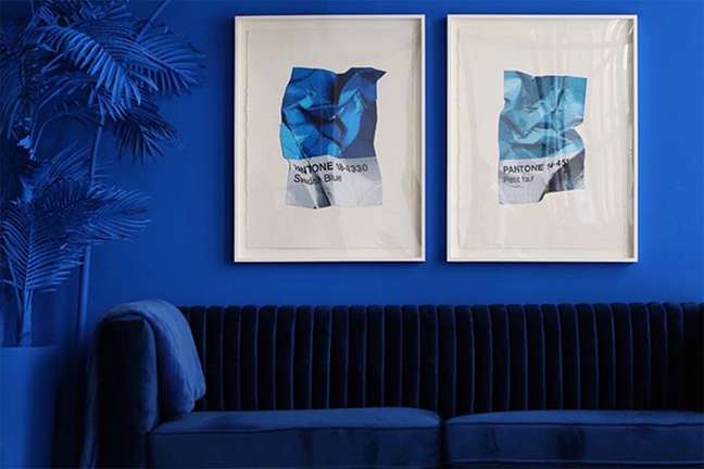
According to Cristina, when the individual thinks of an all-white space, the unconscious – of course – goes to references to places that are clean, but cold and lifeless.
“While we add textures, lights, aromas, sounds, among other elements, we stimulate the sensations of welcome, comfort and refinement. This is why I emphasize the need for a more in-depth study in relation to the psychology of colors and the effects of each environment”, explains.
The composition, therefore, is extremely important to achieve this result and hiring a professional who has knowledge of chromotherapy can make the difference in the search for an assertive project.
colorful house
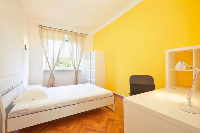
What if the resident wanted to make all the rooms colorful? In order not to be wrong on the question of aesthetics combined with well-being, the architect recommends that there is a design by a professional who knows how to work with multicolored environments.
“We have a multitude of colors, materials and decorative objects for a composition. So the challenge of working with multicolored spaces is to focus on one at a time or to have a cutout.
In this case, without the overview, there is a risk that, putting the concepts together, the house is not in harmony and results in a visual mess “, explains Cristina. Furthermore, the mixture can also bring discomfort to the residents., in direct eye contact.
Start slowly and gradually
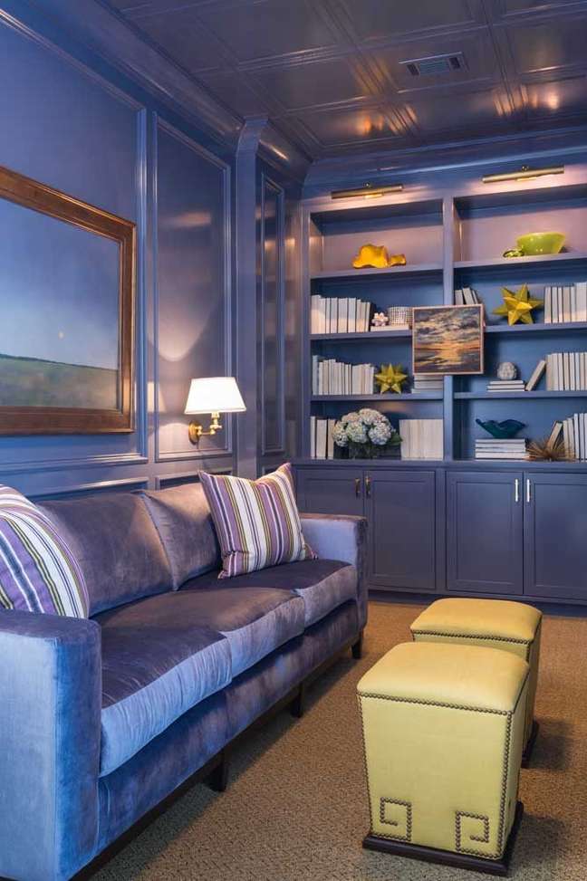
But if the idea is to invest in colors, a very simple tip is to try to choose more neutral tones.
“Very pure colors tend to make the room very lively, charged and even childish. On the other hand, shades with a little gray in the composition (always observe the neutral tone tables) are easier to compose, softer and they can also leave more sophisticated place. “
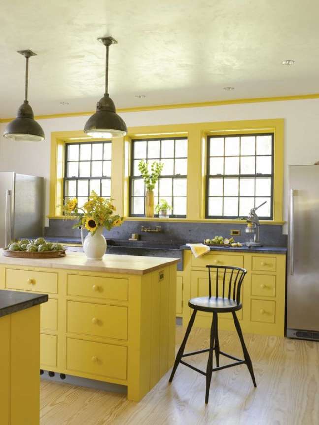
And, if the fear persists or there is a fear of regretting it, he recommends starting in areas that are not very useful, such as the toilets. Apply colorful paint, wallpaper or more vibrant prints to a wall, letting your creativity run wild.
Children’s rooms, especially “play rooms”, are also very suitable rooms for applying very varied colors to walls, furniture and decorative objects.
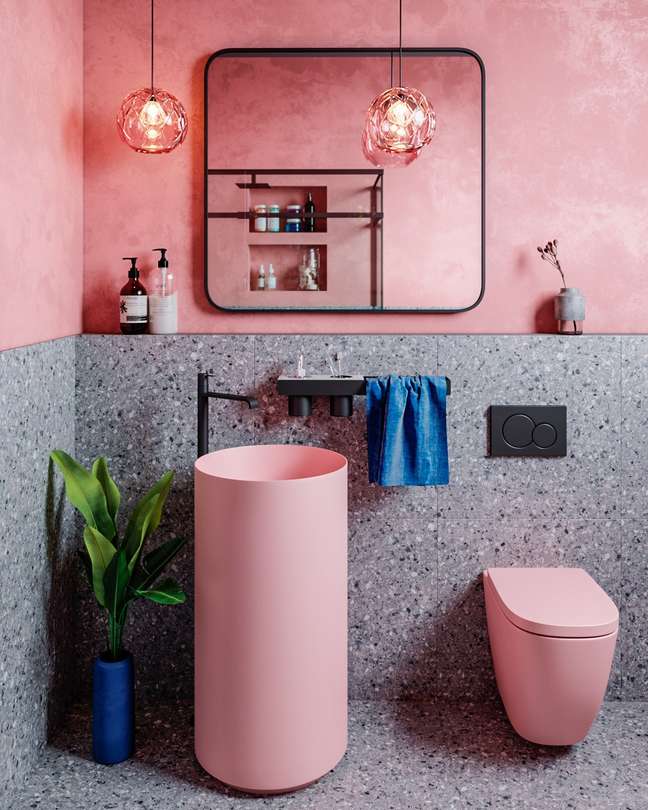
“We still have the balconies, which are places that accept a mix of tones well, as they are usually decorated with plants and furniture suitable for the outdoor space and which already have a more relaxed language”, underlines the architect.
Know the effects of each color:
Red (strength – action – vitality)
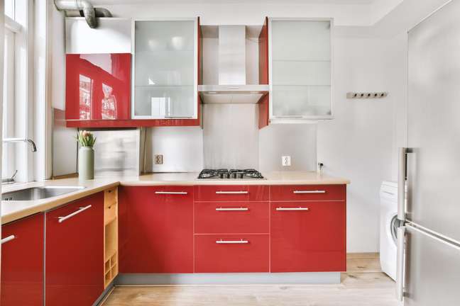
Red encourages self-affirmation and regain self-awareness. Indicated for the treatment of anemia and apathy.
Orange (pleasure – will – expression)
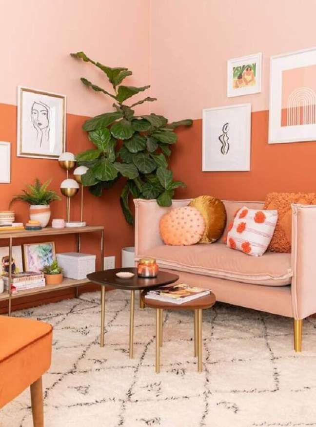
The orange color facilitates expression and helps create a good level of dialogue between people. Eliminate depression and sadness. It also relieves cramps and muscle spasms. It strengthens the bones and stimulates the mammary glands to increase milk production after childbirth.
Yellow (creativity – joy – spontaneity)
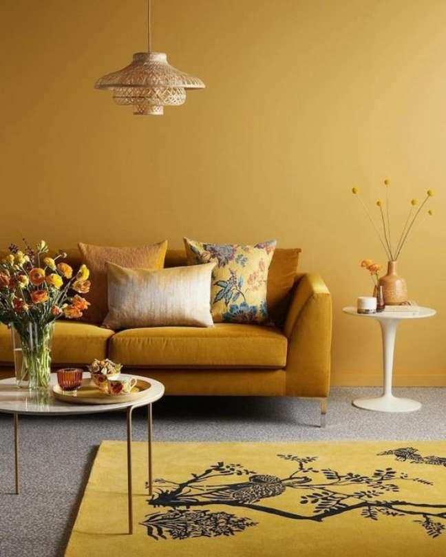
Yellow provides mental clarity and should be used whenever you need creativity and focus.
It stimulates patience, activates tissue regeneration and accelerates the healing processes. In addition, it aids in digestion and activation of the lymphatic system. Recommended for treating skin diseases.
Green (balance – healing – renewal)
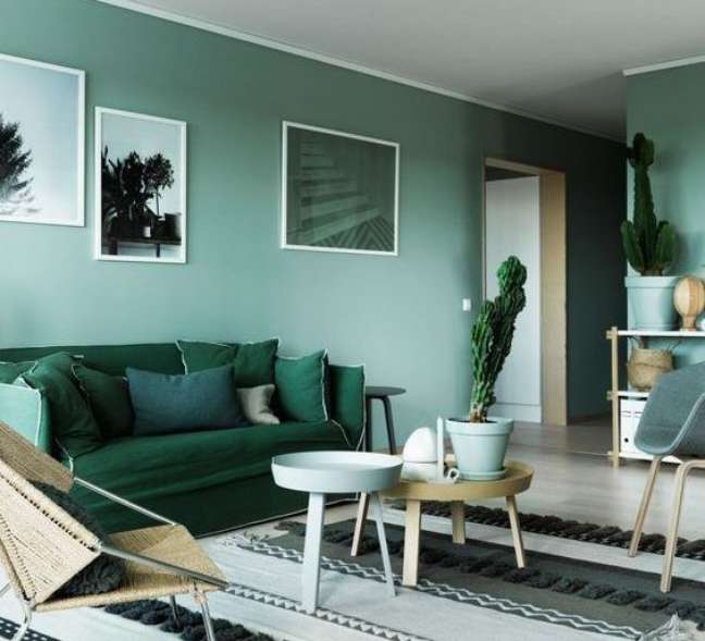
Green has a calming tone to the nervous system, making it essential for treating stress. It allows for a greater understanding of life and the world. Regulates blood pressure and promotes the balance of the whole body. It has bactericidal and disinfectant properties.
Blue (calming – relaxing – tranquility)
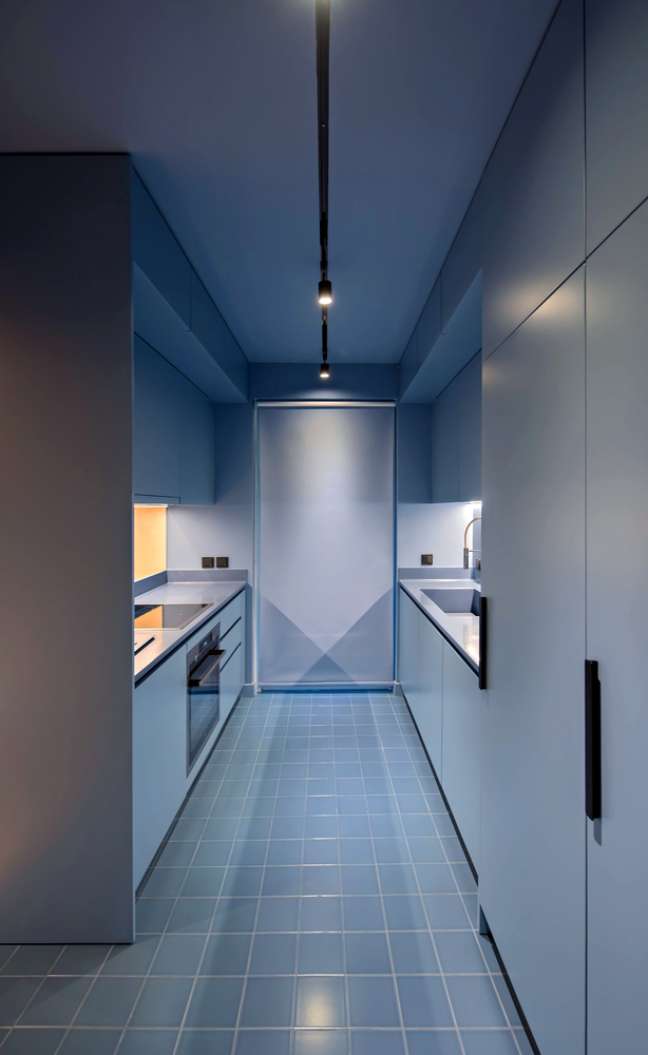
Blue brings calm and peace of mind. It reduces tensions and promotes the expansion of consciousness. Recommended in case of inflammatory diseases and hearing treatments. It also aids in the proper functioning of the thyroid gland.
Violetta (intuition – meditation – spirituality)
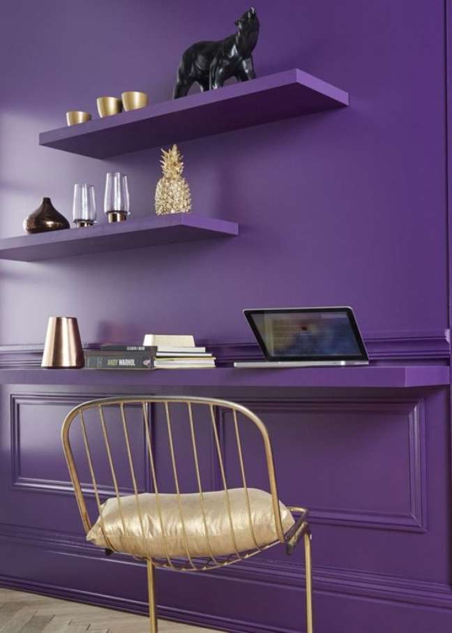
Allows perfect synchronization of body rhythms. Transform lower vibrations into higher ones. It controls irritation and is considered a purifying ray of ideas. It can be used in the treatment of all mental and nervous diseases.
Plus, purple is Pantone’s color of the year, Very Pery!
Source: Terra
Benjamin Smith is a fashion journalist and author at Gossipify, known for his coverage of the latest fashion trends and industry insights. He writes about clothing, shoes, accessories, and runway shows, providing in-depth analysis and unique perspectives. He’s respected for his ability to spot emerging designers and trends, and for providing practical fashion advice to readers.

