Tips on how to use colors in rooms and how to give your home even more personality
At first, thinking about monochromatic décor can seem a little monotonous. But make no mistake, this decorative trick is capable of add a lot of style to the environment. From the chosen color, you can use variations on the walls in furniture and accessories.
And the secret of success lies in the texture variations. For this, bet on the variety of materials, such as wood, fabrics, acrylic and anything else you want. To inspire you to dare a little more in decoration, we have parted ways 10 monochromatic or tone-on-tone environments Just below. Watch!
1. Immerse yourself in the blue

For those who are fans of the color blue, this room is pure delight! Here the tone has been used in its darkest version and has undergone variations in intensity throughout the elements. From the bed, to the wardrobe, passing through the floor, nothing escaped the blue.
2. Neutrals very gracefully

If you think that furnishing an environment only with neutral tones might leave you feeling flat, this dining room proves otherwise. In this proposal the light colors create an elegant tone on tone thanks to the good variety of textures. notice how the wooden table and chairs dialogues in harmony with the light dishes and the shades of the walls.
3. Tones of nature

A yellow color, exuberant by nature, inspires some fear when used in decoration. But, in this room, the mustard-tending tones have been masterfully equalized and everything has become harmonious, thanks to the gray base of the granite floor. The pendant in natural fiber has refined everything with delicacy.
4. Green that calms

There is no doubt: if you want to create a relaxing environment, bet the shades of green. In this room, color runs through the walls and bedding and when combined with gray has resulted in a soft and calm palette.
5. Sweet palette

Pastel tones are also a good choice to use in monochromatic decors, as shown in this home office. The green and blue complement each other softly in the furniture and on the wall. Accessories in softer colors complete the look.
6. Earthy and derived tones

Now, if the idea is to dare a little more, it’s worth investing warm tones. This room begins with an earth tone palette, which colors the sofa and ottoman, and continues with reddish tones, on the wall and cushion.
7. Botanical room

One cool weather invade this room decorated with different shades of green. From darkest to lightest, the greens extend over the wall, armchairs, cushions, vases and plants.
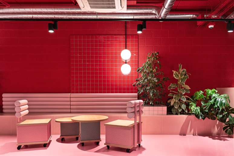
8. Striking purple

Another surprising and bold palette is that of purples. Here the variety of textures has given even more personality to the decoration, which gradually lightens up to shades of pink.
9. Dark and elegant tones

If the idea is to create a completely sober decoration, the dark tones they are the right bet. In this room, grays create the ideal composition for those who want to relax with a discreet palette.
10. Half wall in the foyer

And finally, an idea to play with two complementary tones. In this entryway, two versions of blue create a striking and delicate composition to welcome anyone arriving at the house.
Source: Terra
Ben Stock is a lifestyle journalist and author at Gossipify. He writes about topics such as health, wellness, travel, food and home decor. He provides practical advice and inspiration to improve well-being, keeps readers up to date with latest lifestyle news and trends, known for his engaging writing style, in-depth analysis and unique perspectives.


