Gray may seem cold and lacking in personality, but architect Bruno Moraes shows how to use the tone to create elegant and welcoming environments.
A Color: Grey It is a timeless and versatile option for those who want to repaint walls, cover floors in their homes, decorate apartments or offices. This color was often associated with negative feelings. But there are those who like cloudier days, right?
Over time, gray has gained a lot positive meanings in the decoration of architectural projectsAS sophistication and elegance. be a neutral colorit is an interesting option for those who love more relaxed environments without excesses.
Besides expressing a cleaner frequency, gray is very easy to combine with other tones. In large doses it manages to bring warmth to cold or bright environments. For those who want practicality, especially on the floor, it’s a color that doesn’t show dirt. Also, for pet parents who shed a lot of fur, it’s a great option.

Along with all these attributes, shades of gray bring stability to daily routines and can, according to Feng Shui, help in personal relationships. Read the advice that the architect Bruno Moraes, owner of StudioBMAgave some color.
What does the color gray convey?

We can consider gray a intermediate color between black and white. While not one of the more popular choices, it does carry over into the environment subtlety, versatility and sophistication. Bruno Moraes, explains that hue contributes in different ways to an environment, being positive and negative.

“Grey can bring welcoming sensations when used in bright places. On the other hand, if used too much in darker tones, it can transform the environment into a more secluded space“Bruno says.

For him, just as the color white represents peace in the West and death in the East, gray expresses a duality interesting and that needs care and attention to be used to the fullest.
According to the owner of Studio BMA, depending on the proportion applied in an environment and the cultural issue of the resident, the gray color will transmit different frequencies.
What colors go with gray?

Gray has the ease of being able to be applied in different combinations and allow for creative compositions. However, the architect Bruno Moraes has his preferences.
According to the professional, the shade communicates very well with the black and woody tones. White itself – which we understand as the absence of color -, when combined with lighter shades of gray, allows to obtain an interesting effect. “I really like using very light gray on plasterboard walls and white baseboards,” she adds.
In which decorating styles can we include gray?

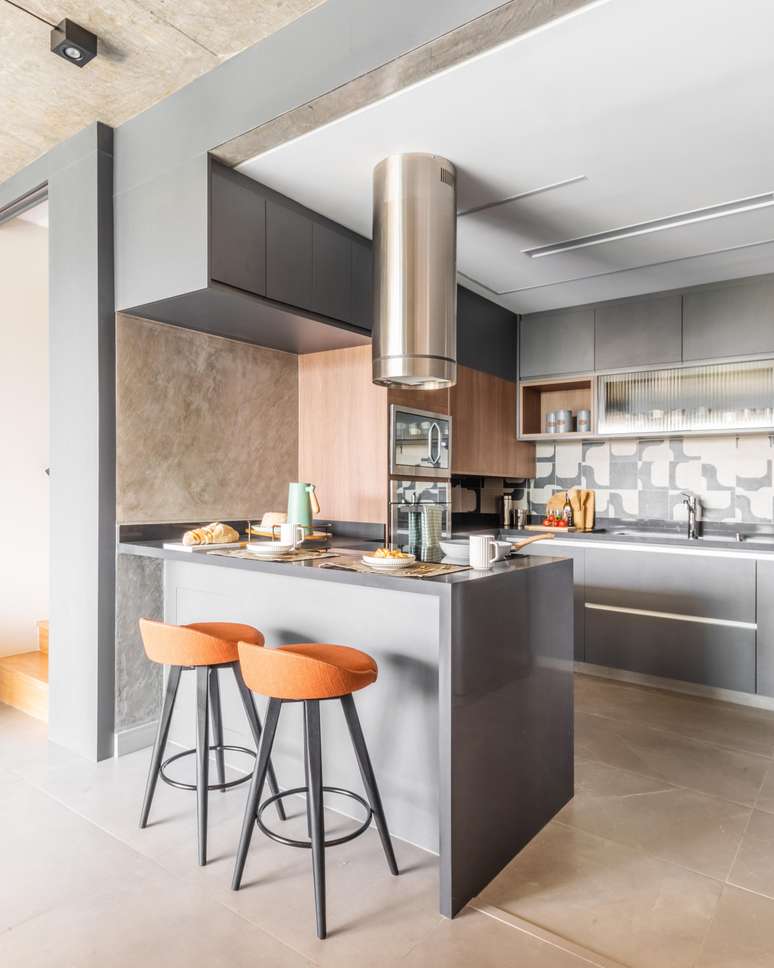
Gray color can be used in all styles of decoration, however, is currently widely used in the industrial style. “In this style it appears with more presence, especially in exposed slabs, burnt concrete, reinforced concrete beams and pillars,” explains Bruno.
How to use gray creatively in decoration?

to have a diversity of tones, gray can add a lot to the decor. We can use it in burnt concrete in furniture, in a decorative object, in the floor, ceiling, walls and even doors.

At that time, references to the composition of the group which we like is a good option. “An interesting tip is that some applications from paint manufacturers do simulations using photos taken by the mobile phone, of what the wall will look like when painted in a certain colour. For those who are not sure, the simulation can help a lot!” points out the owner of the BMA study.
How does gray contribute to the lightness of an environment?

The answer is: in countless ways! The lighter tones are more used when the aim of the environment is to express lightness. Sure, with darker tones care is needed. The recommendation is that they appear little and are combined with lighter tones, creating a perfect balance Between them.
How to work with more than one shade of gray?

The architect comments that the technique of using different shades of gray is very common in his studio. “I like to use the technique of having shades close together, like a ‘tone on tone’, generating contrast between lighter and darker tones.
Depending on the proposal, when we want to create more sober environments, color predominates. Instead, in more vibrant environments, I need to use another color as a highlight and leave the gray as the ‘background'”, adds Bruno.
Source: Terra
Ben Stock is a lifestyle journalist and author at Gossipify. He writes about topics such as health, wellness, travel, food and home decor. He provides practical advice and inspiration to improve well-being, keeps readers up to date with latest lifestyle news and trends, known for his engaging writing style, in-depth analysis and unique perspectives.


