The architects explain how this shade can be used to create uncluttered environments
Different tones, meanings and possibilities. This is the decorating process using blue. Known for conveying tranquility and serenity, this color provides a sense of calm at first sight. It refers to the sea, sky and nature and, therefore, has such a positive influence – it brings a feeling of freshness into the house.
html[data-range=”xlarge”] figure image img.img-a9e5607ba71aaa23625df1413c6e9bed89qkl3u1 { width: 774px; height: 516px; }HTML[data-range=”large”] figure image img.img-a9e5607ba71aaa23625df1413c6e9bed89qkl3u1 { width: 548px; height: 365px; }HTML[data-range=”small”] figure image img.img-a9e5607ba71aaa23625df1413c6e9bed89qkl3u1, html[data-range=”medium”] figure image img.img-a9e5607ba71aaa23625df1413c6e9bed89qkl3u1 { width: 564px; height: 376px; }HTML[data-range=”small”] .article__image-embed, html[data-range=”medium”] .article__image-embed { width: 564px; margin: auto 0 30px; }
Opting for paint, furniture, decor, and accessories in this hue is a safe bet for creating a relaxed ambiance, but you also need to be careful not to go overboard with the blues. To navigate through so many possibilities, architects Carina and Ieda Korman, who give their name to the Korman Arquitetos studio, bring various examples of how to use this rich hue.
Why the blue one?
According to a survey conducted by the American universities of Rhode Island and Wisconsin, in 2022 the favorite color of most people is blue. And the reason is an association of the subconscious with objects that everyone tends to appreciate and value, such as, indeed, the sky and the sky. sea.
A second study conducted in 2009 by the University of British Columbia, Canada, showed that individuals working in front of a bluish screen performed well on tasks of a creative nature.
Blue in decoration
When the topic is decoration, the cold tone is an ally: it goes very well with practically all colors, especially with green – next to it in the chromatic circle – and with orange, red and yellow, whose harmonization is by contrast. Plus, there’s a lot to explore within the shades of blue itself, which, from lightest to darkest, add a lot to the design.
“We bet on this color not only to give a little life to the environment, but also serenity. In a more neutral palette, it helps to highlight the look without being disproportionate to the project proposal”, explains Carina regarding the care post the range of colors during development, also underlining that the classic harmonization with black and white also works well.
strategic choices
Both the hue and the amount of blue, as well as the place where it will be placed, will need to undergo careful analysis. Everything will depend on the desire and personality of the resident: if the desire is to waste the calm, the options are to paint a wall or invest in a joinery completely in that colour. On the other hand, if you are a person who gets bored quickly and always renews small details of the Homethe best way is accessories.
Some items in which it is possible to vary, without making any compromises, are, for example, bed linen and cushion covers and upholstery, floral arrangements, vases, paintings, lamps, among others. But pay attention to these scenarios: the advice is to think of a sober base so that the novelties do not conflict with the furnishings. “The main goal, invariably, is to have a balanced look, that has to be the lodestar at all times,” says Ieda.
Woodwork in shades of blue

The blue joinery is an option for those who love color and want to give a lively touch to the room, obviously without losing elegance. In the first photo, the seatswith backrest in blue nautical rope, they help to enrapture the balcony foodie, which also has the worktop joinery in an oil tone. To the left, the blue stand is complemented by the warmth of the slatted panel of the TV installed in the Home theater.

A bluish panel in perfect alignment with a chest of drawers of a similar tone has given a new look to the home office in the dormitory. Because the color encourages creativity and calmness, it’s a clear choice for the work environment.

Everything is very clear and refreshing: a light atmosphere was chosen for this penthouse in the Riviera de São Lourenço. Blue, balanced between the whites, takes center stage in the kitchen, where the joinery is fully worked in a rich blue color, from the upper cabinets to the central island.
Use of blue on the walls

While it doesn’t exist in the original plan, the toilet has become one of the strong points of this project: it was executed with a blue lacquer portal, with designs in relief, full of personality.

Perfect example of the combination of blue with other colors. Yellow was chosen to compose one of the walls of the room, with the aim of conveying that wonderful feeling of a summer house.
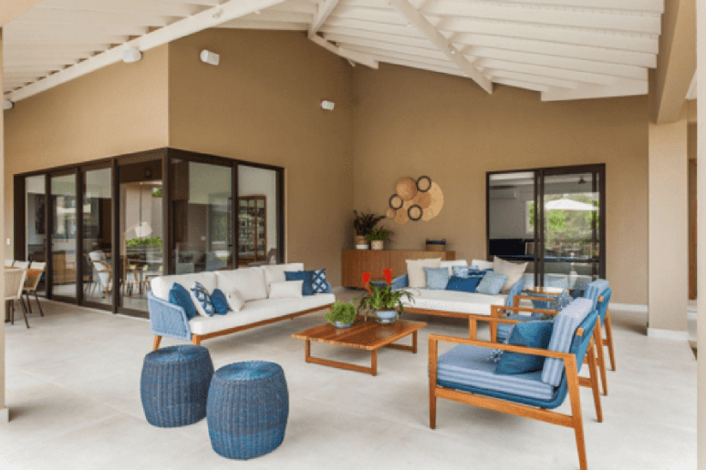
blue on the outside

here is the room it was created with the intention of being an intimate space, where friends and family gather. the blue furniture Home perfectly for the purpose, giving a welcoming and reassuring air to special moments.
Blue in the details

With the furniture marked by minimalism, the blue carpet enters to “break” the palette clean in the project on the left, while still maintaining the serenity that drives the entire room.

Even in the frames and roof structure it is worth betting on a different color, as was the case with this house on the south coast of Bahia. The darker shade was a key element in helping create a lively environmentwhich is up to the sunny state.

Small big details: the accessories never go unnoticed in the furniture — on the contrary, they guarantee harmony, connecting with the other elements of the environment to create a rich atmosphere.
By Emilie Guimaraes
Source: Terra
Ben Stock is a lifestyle journalist and author at Gossipify. He writes about topics such as health, wellness, travel, food and home decor. He provides practical advice and inspiration to improve well-being, keeps readers up to date with latest lifestyle news and trends, known for his engaging writing style, in-depth analysis and unique perspectives.


