Korman Arquitetos shares tips for incorporating natural colors, such as beige, brown, green, and terracotta, into your decor.
Some trends not only stand out, but are perpetuated over the years for their particular ability to create elegant and welcoming environments. Among these, the natural tones have consolidated themselves, both among professionals and among design lovers, and this happens, mainly, as a reflection of a period that has led us to seek connections, be they with nature, society or with ourselves.
The architects Carina and Ieda Korman, heads of the studio, have further clarified the furnishing trend Korman Architectsexplores the enduring appeal of these colours and demonstrates how they can be harmoniously integrated into the most diverse decorative styles.
Natural tones: why are they so popular?

The growing search for well-being and comfort inside homes is the key factor that makes them a very popular and relevant choice in modern design. But not only that, explain the professionals of Korman Arquitetos, natural colors are highly appreciated for their ability to design an environment that always appears current and never out of fashion.

“Without a doubt it is a way of bringing nature into your homesomething that has become even more important in recent years, with people seeking a refuge from everyday stress,” underlines Carina Korman.

These colors awaken feelings of calm and tranquility that have a positive psychological impact. They are also extremely democratic and adapt to any type of project, adds Ieda Korman. “Their versatility allows them to be integrated into different decorative styles, from Scandinavian to rustic, ensuring a timeless aesthetic,” she says. In addition, architects analyze that the palette is always in motion, as they always receive updates through the development of new shades.
What are the trending shades?
Architects assure that the specifications of these colors do not refer to a passing fad, as they offer a timeless palette. Look at some of these shades and their unique characteristics:
Beige sand

This soft tone is ideal for achieving a neutral base in any environment.

“Sand beige is extremely versatile and can be used in any environment, bringing brightness and a touch of refinement,” comments Ieda.

According to her, it goes well with other tones, providing a perfect backdrop for the decor. However, if applied in excess, it makes the environment monotonous or without personality and, to avoid this mistake, it is recommended to completing with various textures and accessories.
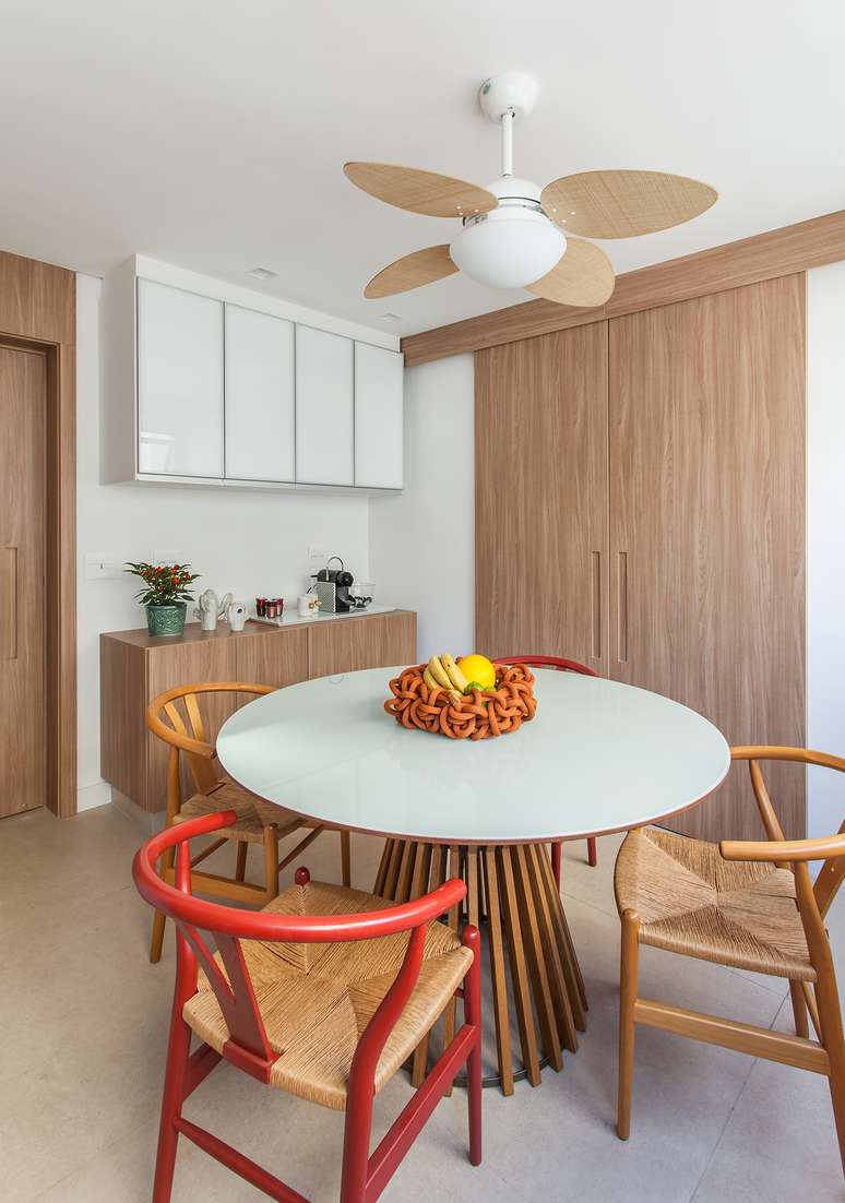
Chocolate brown

Deep and sophisticated, adds chocolate brown luxury and warmth to the rooms. “It is ideal for details wooden furniture or decorative accents“, says Carina.

Color has the power to transform an ordinary room into an ultra-elegant space. “But if used too much it can harden the decoration, so we combine it with other lighter colors and adequate lighting,” she warns.
Terracotta

“Lively, terracotta evokes warmth and can be applied to walls or accessories for a Mediterranean touch“, Ieda emphasizes.

Its versatility allows it to be present on both large surfaces and small details. However, its intensity can dominate the environment if not performed with moderation.

Olive green

Reminiscent of tree leaves, olive green is soothing. “I really like it when the intention is to provide a natural and serene environment, which works well in living rooms and bedrooms,” say the architects at Korman Arquitetos.

This color evokes freshness and connection with the outdoors, even in urban environments.
Grey boulder

This is a neutral shade that combines the best of both worlds: earthy and modern. “Pebble grey is an invitation to stability and is perfect for contemporary loft and studio architecture,” says Ieda.

He also adds that the color pairs perfectly with materials such as steel, iron and glass. However, too much of it can leave a room feeling cold or impersonal, and to avoid this mistake, Ieda and Carina Korman recommend pairing it with more intense textures and colors.
Yellow

Ecstatic and cheerful, yellow is great for brightening spaces and adding a warmer touch. “For those who are afraid of using such bright colors, yellow can be present details like pillows and blanketsgiving a welcoming effect”, suggests Carina.
Red tile

Warm and inviting, the red tile It is a master at forming focal points in a room and its deep tone transforms a plain area into a space full of personality. Caution: as recommended with the previous colors, overdoing it will overwhelm the environment.

How to Compose Colors with Different Decorative Styles

- Scandinavian: it goes well with tones such as sand beige and gravel grey, always with the aim of maintaining the minimalist aesthetic and adding a touch of warmth;
- Boho: Combinations of terracotta, olive green and ochre yellow create a vibrant and welcoming atmosphere;
- Rustic: Chocolate brown and brick red are great for highlighting wood and other natural elements typical of this style;
- Modern: For a contemporary look, pebble grey and olive green add subtle elegance.
Source: Terra
Ben Stock is a lifestyle journalist and author at Gossipify. He writes about topics such as health, wellness, travel, food and home decor. He provides practical advice and inspiration to improve well-being, keeps readers up to date with latest lifestyle news and trends, known for his engaging writing style, in-depth analysis and unique perspectives.


