The image consultant teaches you how to find the colors that best suit your skin
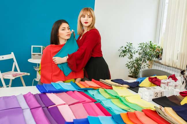
Personal color analysis is performed by an image consultant. In this test, she uses fabrics to find out which colors make the skin tone more even and radiant and which help mask blemishes, wrinkles and dark circles. This method applies to clothes, makeup, hair color and metal accessories. Based on the test, each person’s color chart is defined. Subsequently, image consultant Joana Brizola explains this new trend. Watch!

How does the personal coloring test work?
The personal color analysis is done in person, but, according to Joana Brizola, some professionals already carry out the test online. However, there is still debate on the effectiveness of the remote procedure. For her, the most reliable method is Expanded Seasonal. This is because the main goal of this test is to find the skin characteristics (temperature, intensity and depth) and colors that have these same characteristics.
“During the process, I start by analyzing the client’s personal contrast: whether it is high, medium, low or dark. Then I move on to the temperature analysis, in which I diagnose the client’s skin undertone, which can be cold, neutral cold, hot or neutral heat, so to say that you discover the undertone of the skin from the ‘color of the veins’ is a myth “, explains the image consultant.
Analysis of the intensity and depth of the skin
Next, the intensity of the skin is analyzed to see if it is intense or smooth. “For example, intense skin looks good with highlighters in makeup or deep tones, such as pink. People with soft skin will look better with duller tones,” explains Joana Brizola.
Finally, depth analysis is performed (if they combine more with light or dark tones). Deep dark skin looks best with darker ea colors skin with depth clear, with whiter colors. “It is important to say that the color is valid from the waist up, because it is what is close to your face and can enhance or ‘erase’ your skin”, emphasizes the specialist.
How to find out the tone and tone of the skin?
According to the image consultant, the discovery of tone and undertone occurs during the personal color analysis process. “It is the second phase, together with the discovery of the temperature of the skin. Also, do not fall into the myths that if you tan in the sun, it is hot. If it turns red, it is cold. This does not exist, because the temperature of the skin depends on the skin temperature amount of hemoglobin or carotene present in your melanin, “says Joana Brizola. Therefore, these characteristics are in her undertone and are not visible to the naked eye, i.e. only the professional image consultant, with the necessary equipment, can analyze these characteristics.

Types of color chart
The color charts were classified using the names of the seasons. Within the extended seasonal method, there are 12 different categories. Are they:
1. Pure winter
Cold temperature is the determining factor. 100% cool colors will be ideal for this card.
2. Bright winter
The predominant feature is the intensity: cold colors and with a lot of saturation enhances the skin who has this card
3. Dark winter
In this card, depth dictates the rule. So cool and dark colors are always the best.
4. Pure autumn
It is characterized by the warm temperature: colors warmer and more intense marks the overview of the card. Think orange, red, canary yellow.
5. Soft autumn
Its primary feature is soft intensity, that is, warm and dull tones. Therefore, it is worth investing in teal, olive and light brown tones.
6. Dark autumn
It is characterized by depth – warm, dark colors like oil, caramel and brown are best. This paper also has black, but it is not a premium color (the ones that have all three characteristics: temperature, depth and intensity).
7. Pure spring
The predominance is of warm colors and without the addition of black in the composition: looking at this card is practically observing a flower garden at noon.
8. Bright spring
We found the most saturated (with a lot of brightness) and always warm colors, such as orange and red.
9. Clear spring
In this category there are warm and soft colors, very delicate, like premium.
10. Pure summer
Here are cool and pure colors. It is the lightest cold paper of the expanded seasonal method. One color in this category is light blue: soft and fresh.
11. Soft summer
Here the colors are still cool, but with more gray addition. They are duller colors, so the “last name” on the paper is “soft”.
12. clear summer
This is the lightest card. Cold colors are more muted, with pastel tones and very delicate.
Source: Terra
Benjamin Smith is a fashion journalist and author at Gossipify, known for his coverage of the latest fashion trends and industry insights. He writes about clothing, shoes, accessories, and runway shows, providing in-depth analysis and unique perspectives. He’s respected for his ability to spot emerging designers and trends, and for providing practical fashion advice to readers.


