As the end of the year approaches, trends for 2023 have already begun to appear. Discover the trendy colors for next year
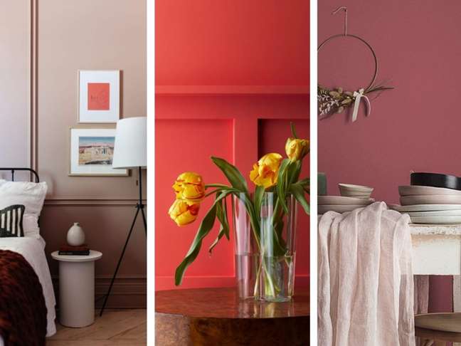
We are almost at the end of the year, and that means that the furniture trends for next year are already here! Some companies have already revealed theirs The colors of the year 2023🇧🇷 Considering the ones we’ve seen so far, the direction of the color palettes seems to point towards warm earth tones, inspired by natural elements, none of them atypical like Very Peri from Pantone 2022, or very vibrant like Illuminating from Pantone 2021.
Curious? Find out which shades have been released here and get inspired for next year’s decor:
Sherwin-Williams: Redend Point
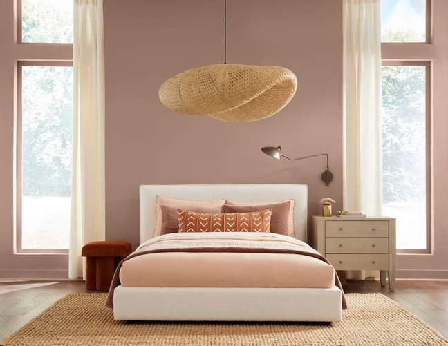
A mix of pink and brown, this beige shade evokes the comforting feeling of earth colors. Neutral and delicate, the color is quite versatile and promises to bring a lot of coziness.
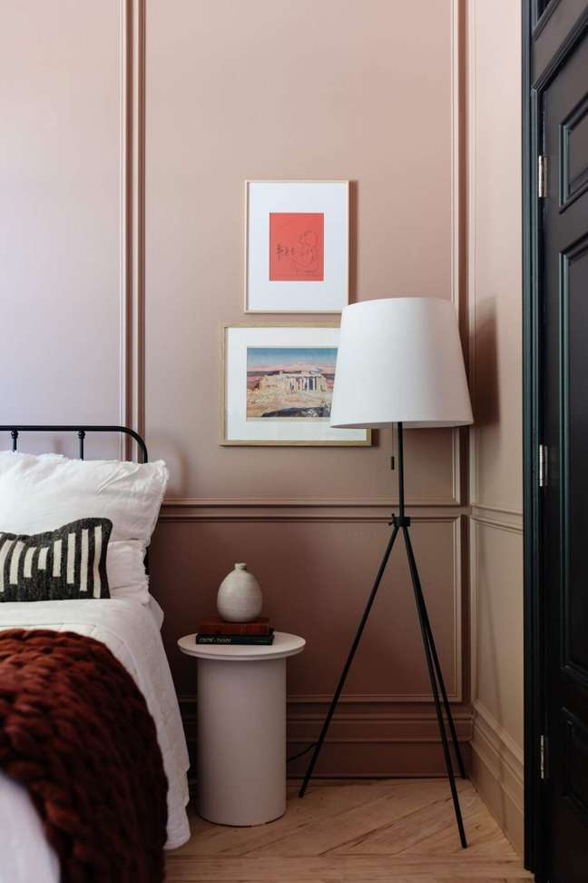
“For the past couple of years, people have been drawn to nature-inspired earth tones, and that’s something that will continue into 2023 and beyond,” says Sue Wadden, Sherwin-Williams director of color marketing. “Greens, blues and browns can make any space feel safe, relaxed and grounded, yet still full of energy.”
Dunn Edwards: Pink Earth
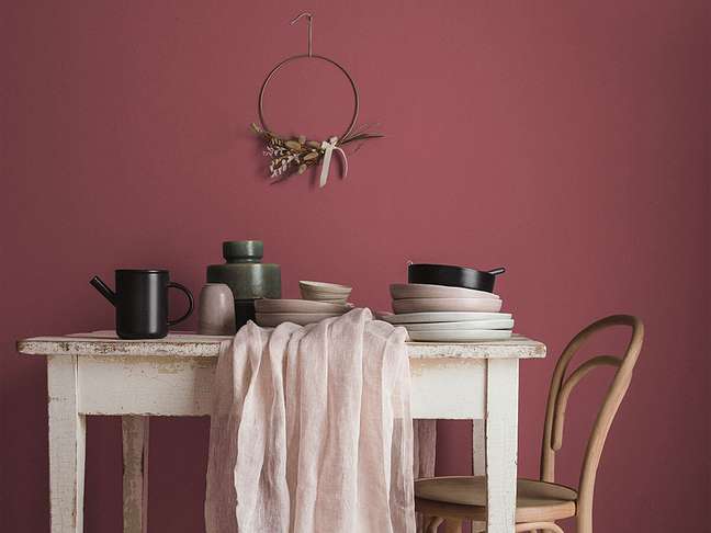
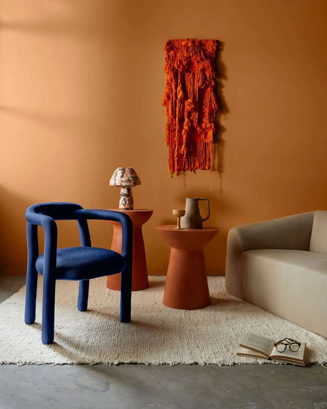
More intense than Redend Point, the Terra Rosa shade brings a deeper, wine-like touch of pink. This color will certainly warm rooms with a touch of rusticity.
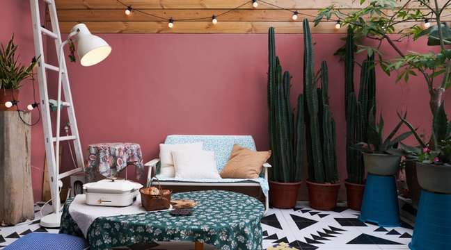
The brand describes it as “a deep pink shade with a touch of terracotta that exudes confidence, creativity and warmth. Reflecting just the right amount of introspection, this cinnamon pink shade is strong yet accessible and acts as a refreshing neutral refresh. To browns and bordeaux. “
Benjamin Moore: Raspberry Blush
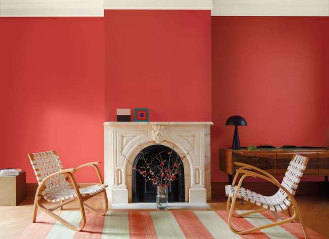
Vibrant and upbeat, Raspberry Blush is described by Benjamin Moore as “a vibrant shade of pink coral, which Blush enlivens the senses with electric optimism”. Of the hues unveiled so far, this is the liveliest – it even has a Spotify playlist!
For those looking for vigor in 2023 and willing to be daring in decor, this color will bring optimism to their designs.
Coral: silence in winter
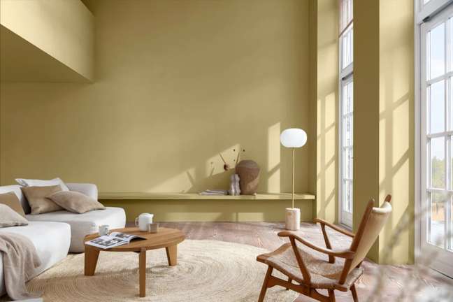
Exuding tranquility, the Silence of Winter color seeks to bring positivity through contact with nature. The inspiration came from the concept of transformation, represented by the seed.
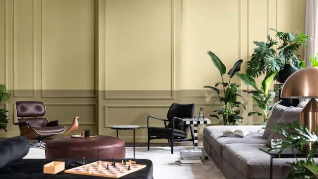
According to Akzo Nobel, the name “silence” evokes the fullness of nature and “winter” conveys the magic present in its transformations. They describe it as “a positive and natural color that, by connecting us with nature, makes our home more welcoming”.
🇧🇷The best content in your email for free. Choose your favorite Earth Newsletter. Click here!
Source: Terra
Benjamin Smith is a fashion journalist and author at Gossipify, known for his coverage of the latest fashion trends and industry insights. He writes about clothing, shoes, accessories, and runway shows, providing in-depth analysis and unique perspectives. He’s respected for his ability to spot emerging designers and trends, and for providing practical fashion advice to readers.

