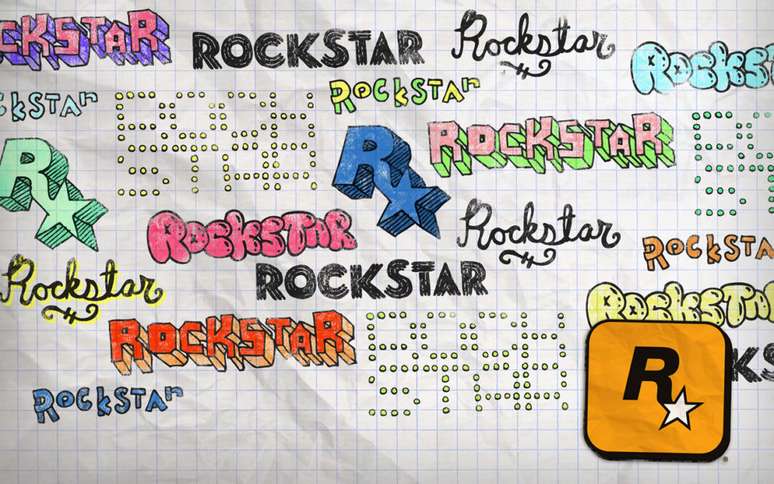
Intended to serve as a sticker, the creation of Rockstar’s logo alludes to the anarchic environment in which the studio was founded.
Founded in 1998, Rockstar has become one of the most popular developers in the world, synonymous with high quality games with great entertainment power. But besides being known for the series Grand Theft Autothe studio has also become famous for its logo, a brand that serves to partially explain the birth of the company.
According to Karen Scott, it all started right after the founders chose the name of the studio, when someone suggested an unusual idea for the promotion: putting logo stickers on walls and pay phones in New York.
“It has to be a sticker and it has to have glue that you can’t remove even if you try, like when you were a kid in the ’70s when you put it on the bed and it couldn’t be removed.” explained the current design manager. . “So the design of this really had to be in things that, once you stuck it, you could scratch it and scrape it off, but you couldn’t remove it.”
Scott also said that the rounded shape of the edges was also designed with this in mind, to make it difficult to remove after the sticker has been stuck around town. Additionally, the 1970s would have a major impact on the creative process he shared with Jeremy Blake, with the golden yellow directly referencing the early Kodak logos and rock and roll of the era.
Because Rockstar’s anarchic streak wasn’t just going to show up in an offbeat marketing campaign or the games they created. According to the designer, the professionals at the multi-British company seemed to have little idea where they were.

“We would go to restaurants in groups and get kicked out of every restaurant we went to,” said Scott, who was known as Karen Mui at the time. “It was bad, and I had to convince them: ‘You know, in the US they have guns here, you can’t just go random and try something on someone. You don’t know what you’re going to be dealing with.'”
According to the professional who now works at Microsoft, the union between those people was so great that they even created and wore rings, with the group almost functioning as a cult. However, their behavior became so chaotic that when Karen became pregnant, she realized she couldn’t raise a child within Rockstar’s philosophy.
“It was getting crazy over there and when Jeremy left [da empresa], I dated him, ”he revealed. I decided to hang out with him because he was getting a little wild and I think for us… And then when Rockstar really started going big, that’s when weird things happened all over the place.”
While at Rockstar, Karen Scott also helped create cover of GTA 2as well as being part of the team that developed the games Earthworm Jim 3D AND Thrasher presents Skate and Destroy. However, there is no doubt that his greatest achievement has been creating one of the most recognizable logos in the industry.

For those who weren’t living when that studio was in its infancy, it might be hard to fathom its importance to the industry. In addition to the series Grand Theft Autohave entertained many people with games like Midnight Club, manhunt, Red dead revolver and they were even responsible for taking the Max Payne 2: The Fall of Max Payne for consoles.
The interesting thing is to know that the name of that developer does not seem to have been chosen at random, since those responsible behaved like real rock stars. This was also seen in the investments the company made in nightclubs, cinemas and even record companies.
That is, when it comes to eccentric people from the 90s related to the gaming world, we can not think that this was exclusive to John Romero.
Source: Time extension
Rockstar: the chaos represented by a logo
Source: Terra
Rose James is a Gossipify movie and series reviewer known for her in-depth analysis and unique perspective on the latest releases. With a background in film studies, she provides engaging and informative reviews, and keeps readers up to date with industry trends and emerging talents.


