Coral revealed today (14) its Color of the Year for 2024, a timeless and elegant shade of pink, called Lugar de Afeto.
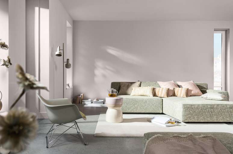
In a world of uncertainty and constant change, it is essential to build a private sanctuary, a place where we can feel comfortable and safe. And what better reference for hospitality than our home, with spaces that we can transform to reflect our personality, our tastes and our uniqueness? What if this could be done through colors? With the theme My Place in the World, Color Futures 24, a study of color behaviors and trends from AkzoNobel, maker of Tintas Coral, highlights its Color of the Year: Place of affection. Discreet and elegant, inspired by the lightness of feathers and the delicacy of clouds, it is a solid base for various combinations.
html[data-range=”xlarge”] figure image img.img-9112d5f186dcdfc7df944e352d65cd416i363sgo { width: 774px; height: 513px; }HTML[data-range=”large”] figure image img.img-9112d5f186dcdfc7df944e352d65cd416i363sgo { width: 548px; height: 363px; }HTML[data-range=”small”] figure image img.img-9112d5f186dcdfc7df944e352d65cd416i363sgo, html[data-range=”medium”] figure image img.img-9112d5f186dcdfc7df944e352d65cd416i363sgo { width: 564px; height: 374px; }HTML[data-range=”small”] .article__image-embed, html[data-range=”medium”] .article__image-embed {width: 564px; margin: 0 automatic 30px; }
“Two decades of Color Futures have captured the essence of significant shifts in society’s tastes, desires and priorities in all their complexity, reflecting real-world events and providing context for each era. In this edition, I would argue that if a color could embrace your home, this color is, without a doubt, a place of affection”, explains Juliana Zaponi, Marketing Communication and Color Manager for decorative paints at AkzoNobel.
“Warm and delicate, the color of 2024 brings a touch of softness and comfort to decoration, without being overly romantic. It’s a pink tone from neutrals palette which perfectly reflects the feeling that the house is a timeless refugeadapting perfectly to current trends”, says the manager.
With the concept of “a space to call your own”, the color design experts at AkzoNobel’s Global Aesthetics Center carefully searched for the perfect color of the year that would convey a sense of welcome and belonging.
A group of multidisciplinary professionals from different countries share with the company their impressions on current social, cultural and behavioral aspects to arrive at the Color of the Year, as well as the accompanying palettes, all always in harmony with the central theme. In the case of Brazil, the country was represented, once again, by Adriana Pedrosa and Carlota Gasparian, designers of Color and Surface.
“We were looking for a soft, welcoming color that could transform any home into a personal refuge to address the challenges each of us face on a daily basis. We were looking for a soft, positive color to use alone in a simple décor scheme or to complement the wide range of other colors. We have developed a harmonious collection that helps create the ideal atmosphere for every type of person,” explains Heleen Van Gent, creative director of AkzoNobel’s Global Aesthetics Center, based in Amsterdam.
Discover the three trends and Color Futures 2024 palettes:
Trend 1: Search for belonging

The Consumer of the Future report from trend analysis reference WGSN highlights that “in 2024, the idea of family will be defined by who you choose to keep with you, not just your genetic or geographic origin.” This perception stems from the fact that society appears to be in a permanent state of change. And what better place to begin this ongoing adaptation than at home, where we identify and collect memories?
Search for the relevant color palette: Global earth tones are the ideal complement to natural materials such as clay, terracotta and wood, adding a sense of tranquility and a high dose of comfort. In addition to the color of the year, tones include Neutral Normandy, White Rabbit, Toasted Grey, Promised Land, Romantic Gift, Baroque Corner, Tea Box, Basketball and Carved Stone.
Thiago Oliveira
The TV presenter who recently became a father was announced as a representative of this color palette. Thiago speaks openly about the racial issues that permeate his life as a black man and talks about representation in Brazilian media spaces.
Trend 2: search for inner peace

In an increasingly complex and chaotic world, we experience an overload of information, tasks and responsibilities. We need to find a space where we can disconnect and free our mind, focusing on what really matters: light, air, nature, love. In our home we can create a personal refuge by focusing on these simple riches.
Inner Peace Color Palette: Inspired by the tones of forests and seascapes, soft greens and blues bring clarity and a peaceful, relaxing atmosphere to any room. Furthermore, they combine perfectly with natural materials such as wood, cork and wool, true treasures of nature capable of adding beauty and personality to the home. In addition to the Color of the Year, the palette consists of Winter Square, Autumn Leaves, Pale Clover, Natural Lagoon, Pebble Mine, Pale Blue, Pico da Neblina, Vibrant Navy, and Horizon.
Thaila Ayala
Representing this trend is the actress and model Thaila Ayala, a mother of two who shares on social media the challenges of motherhood, maintaining balance in daily life and the search for self-knowledge.
Trend 3: Search for contentment

Studies show that these small doses of joy can train our brains to think and feel more positively. Our homes can be the place to celebrate these simple and pleasant moments.
Contentment color palette: Soft shades of lavender and modern yellows to lift your spirits and bring a sense of happiness. Without being excessive or invasive, these colors blend perfectly with natural materials and are capable of enhancing any type or collection of furniture. They can be a positive and invigorating backdrop for creative mixes of objects and flowers for an extra dose of charm. Modern pastel shades to use alongside the Color of the Year are Lilac Tune, Peach Syrup, Desert Landscape, Violet Orchard, Sapling, Winter Silence, Date, Waterfall Trail and Black Pepper.
Astrid Fontenelle
Positive and cheerful, mother of a teenager and known for discussing issues related to behavior, relationships and current events on TV, presenter Astrid Fontenelle is the one who represents this palette.
Source: Terra
Ben Stock is a lifestyle journalist and author at Gossipify. He writes about topics such as health, wellness, travel, food and home decor. He provides practical advice and inspiration to improve well-being, keeps readers up to date with latest lifestyle news and trends, known for his engaging writing style, in-depth analysis and unique perspectives.


-1iaxobpd2r4mo.jpg "In the middle of the investigations, Bruno Henrique’s wife resigns the captain of the “flasosos”, says Jornal")
-1h7wzdmwb1nhy.jpg "Mel Maia is a boxing champion, says the newspaper")