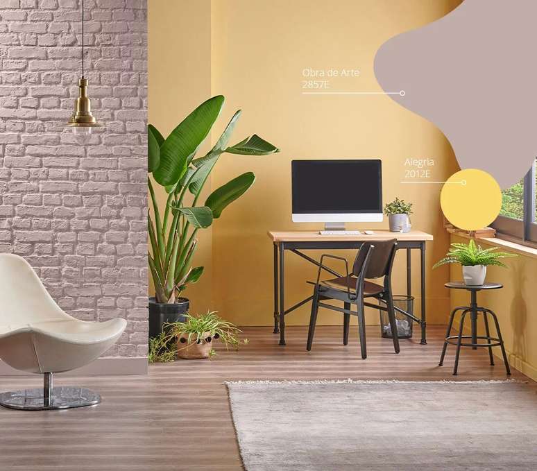
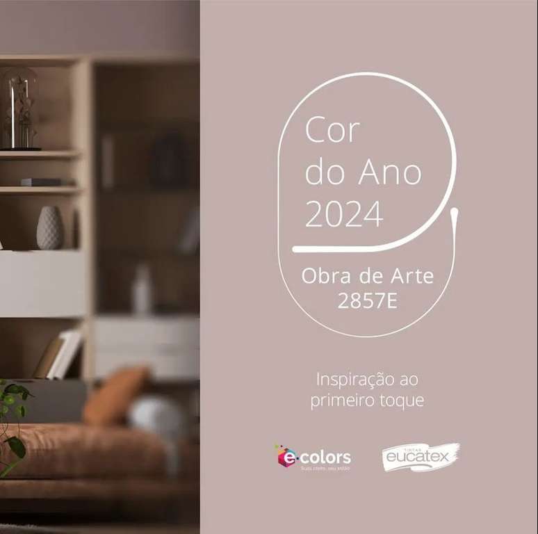
The color has notes of yellow, pink, brown and grey, in a combination that has the adaptability of neutral tones, without losing sophistication.
Understanding the contemporary to reveal the futures, which are multiple, and then identifying those that work best for the Brazilian reality and that of Tintas Eucatex customers. This is the starting point of the in-depth research that leads to the choice of the Color of the Year by Tintas Eucatex, which for 2024 is Illustration 2857E. The multidisciplinary study, as in previous years, is signed and coordinated by Tendere Pesquisa and Soluções Criativas.
Second Dr. Patricia Sant’AnnaCVO (Chief Visionary Officer) of Tendere, based on the understanding of the different scenarios identified to think about trends, it emerged that the color of the year 2024 should carry meanings such as simplicity, security, tranquility, awareness, connection with nature, balance, minimalism, maturity, flexibility, adaptability, affection, comfort, nature, self-care and personal responsibility. ” Artwork It is not a color with a very vibrant intensity, but it is quite sophisticated and works with everything that research has shown about the contemporary context,” says Patrícia.
The chosen color has notes of yellow, pink, brown and greyish, in a complex combination, which has the typical adaptability of neutral tones, without losing sophistication. It is therefore a color that naturally awakens calm, relaxation and security with an openness towards new things.
More than indicating the color that should characterize next year, the study demonstrates how it works within creative trends. “The creative trends of Tendere are organized into four macro flavors: Tropical pop, urban Latin, Karioka and sophisticated. They are found throughout the southern hemisphere, but Brazil is what we observe and where we developed the study. And within this universe, we highlight four Trends: Joy of Living, In the Right Size, Aquatic Contemplation and Odyssey“, explains Patricia.
Discover the four creative trends
Joy of life
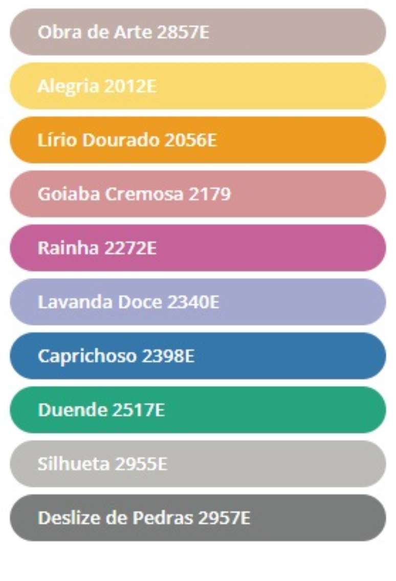
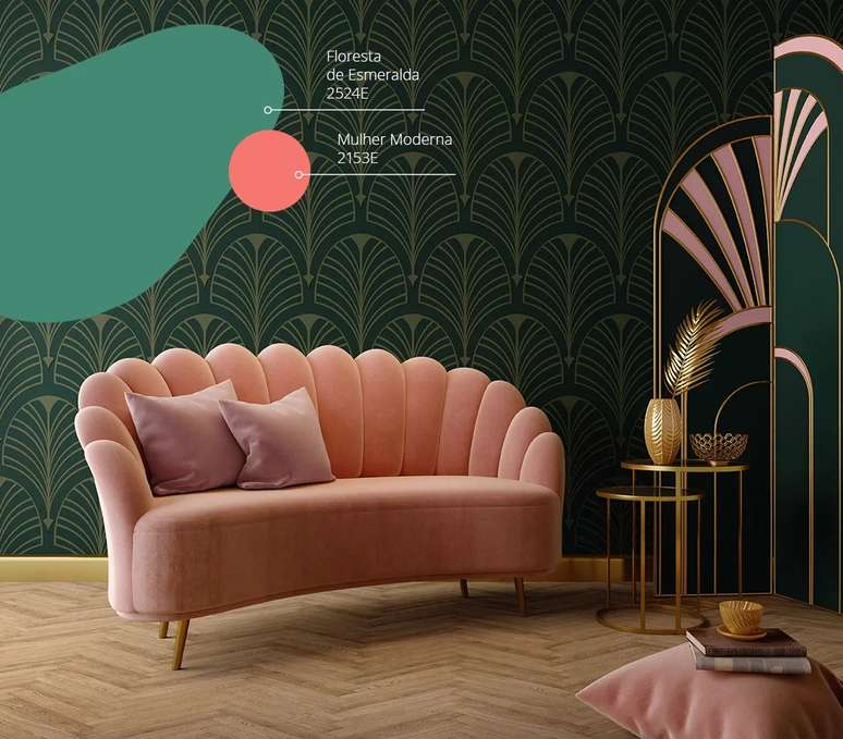
Group tendency Tropical pop, defines herself as a person who is not afraid of colors, is intense, and is for this moment effusive, returned to parties, to shows, returned to personal and no longer digital hugs. Courageous mixes of colours, in which luxury and casual mix, comfort and ostentation, colors and brightness blend together, in unusual design mixes that give fun and identity to the environment. And Obra de Arte manages to dialogue with very intense colors, like Lírio Dourado, Alegria. Check out the full color palette:
In the right size
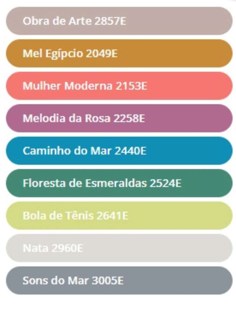
Trend identified for the group Urban Latin, who loves to know all the references, everything that is happening. As Patrícia points out, he is a “follower of international trends, who wants to demonstrate that he knows everything, but at the same time he will work with a reference that speaks a lot about tradition. It is a mix of past and present, which demonstrates how heritages are reinvented at interior of a country and this is also a way of working with colors, according to Patrícia: it is the desire for acceptance (tradition) contrasted with the desire to be recognized as someone in tune with new ways of being in the highly contemporary technological world. From inspirations from periods recognized as traditional, such as the 50s and 80s, to fusion with digital technological sensibilities, here is the palette for this group:
Aquatic contemplation
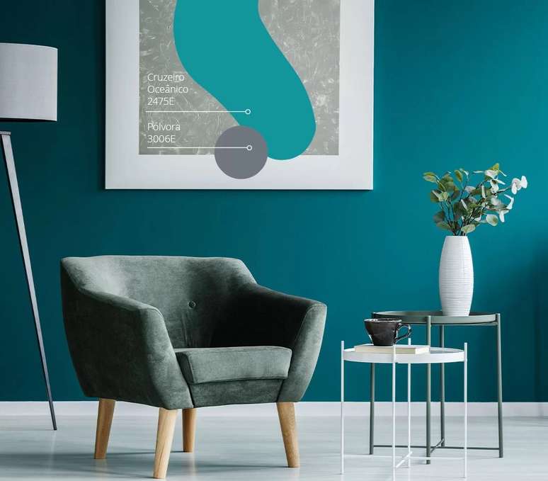
Tendency towards the so-called group Karioka, which looks a lot abroad but manages to bring international trends into casual, giving it the Brazilian bossa. This trend is filled with the idea of taking a break and connecting with nature. In times of debates and projects to save the oceans, river basins, rivers and streams, as a powerful means of defense for the planet, this is a trend that invites us to take an almost meditative pause in front of water, the essence of life. . Check out the color palette:
Odyssey
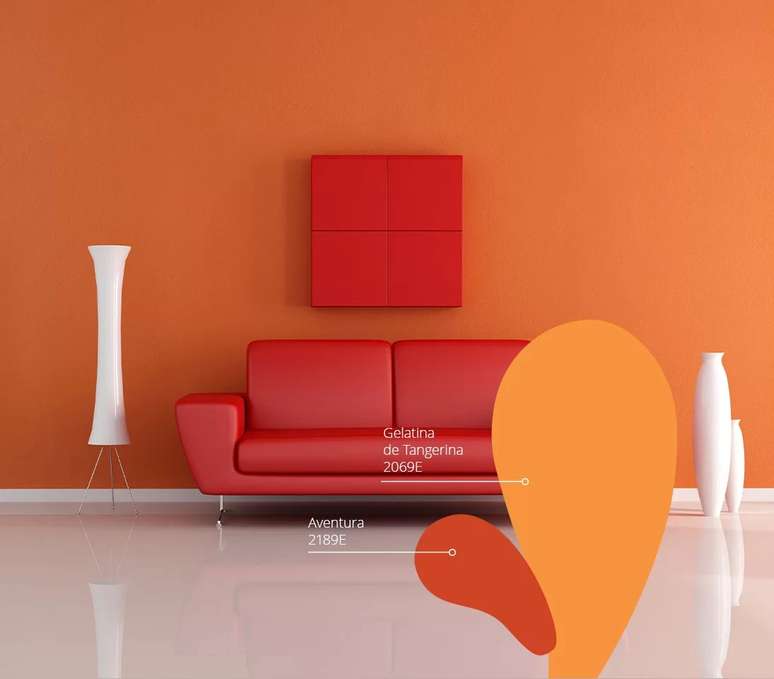
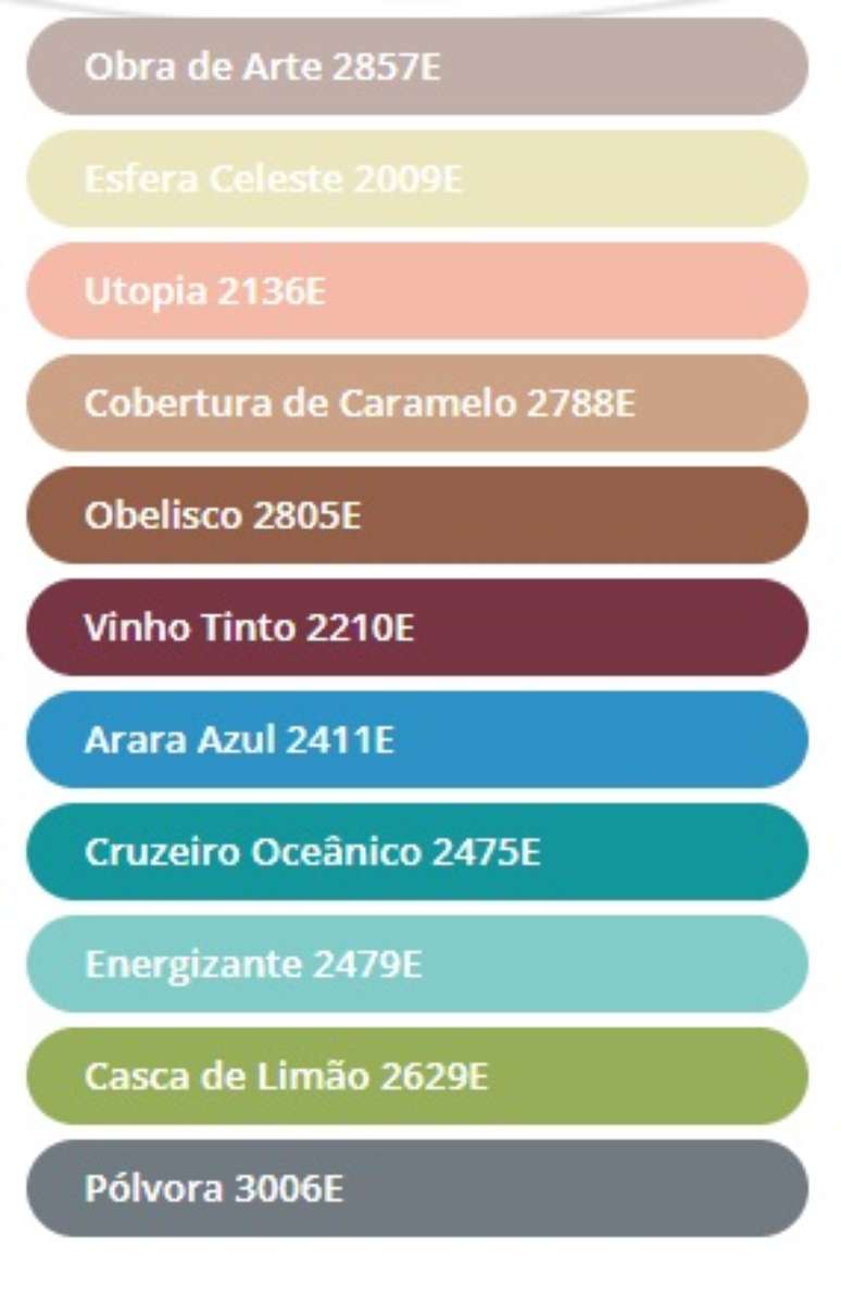
Tendency towards the group that Tendere calls Sophisticated, with a very sophisticated cultural capital, which has great refinement, but which also brings the idea that after everything we have faced in recent years, we have the feeling of being heroes, of having overcome obstacles, trials, just like Ulysses in the Odyssey – Homer’s epic poem. For this reason, in this trend, luxurious references from the East, or ancestors, combine with a minimalist and elegant vision of the West, in search of a balance between pleasure and conscious life. Sustainability, artistic sophistication, self-knowledge, silence and harmonious coexistence is what this trend represents. Here is the palette of colors complementary to the Work of Art:
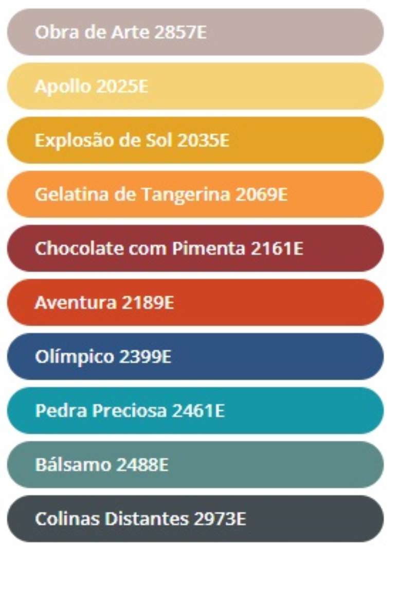
Illustration 2857E and all the complementary colors present in the palettes of the four creative trends are part of Tintas Eucatex’s exclusive pigmentation system, E-Colors, which features the most advanced technology for the preparation of paints, offering more than 5 thousand color options to the consumer and is available in various stores throughout Brazil, and from which the Tendere per Tintas Eucatex study starts.
Product Manager of Tintas Eucatex, Argemiro Sanches highlights the reveal of the Color of the Year as the completion of a continuous process. “He is involved in the work due to the search for quality that we carry out daily in our laboratories, he is present in the choice of the best raw materials and in the improvement of the formulations that bring the best of paints to the Brazilian market. “
Source: Terra
Ben Stock is a lifestyle journalist and author at Gossipify. He writes about topics such as health, wellness, travel, food and home decor. He provides practical advice and inspiration to improve well-being, keeps readers up to date with latest lifestyle news and trends, known for his engaging writing style, in-depth analysis and unique perspectives.


-t8431tbjr50x.jpg)
