Find out how to combine these two elements to create harmonious, welcoming and happy environments
With the advent of hybrid working and the growing search for environments that provide well-being and versatility, the careful choice of colors has become an essential tool for creating spaces that respond to the different needs of daily life. By opting for tones, textures and lights that promote a pleasant atmosphere, it is possible to transform not only the aesthetics, but also the functionality of the environments.
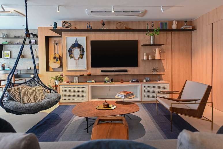
The team at Yamamura, an online lighting store, presents the 108 m² apartment designed by architect Bruno Moraes, underlining the importance of colors and lighting to promote comfort and well-being. Check it out below!
1. Match the colors to the style
The apartment of contemporary style It features touches of color and some industrial features, which help bring life and functionality to the spaces. In the TV room and bathroom, for example, Bruno intensified the shades of blue; already in the area foodie, the terracotta color acquires prominence. Since the apartment has integrated environments, one of the concerns was the perfect harmony between the rooms.

2. Color psychology
Regarding materials such as walls, coverings, furniture and accessories, the architect looked for shades that bring the best sensations, always in accordance with his objectives. Therefore, for those who are studying which shades to include in their home, it is worth delving into the psychology of colors, in which each choice is responsible for different emotional reactions and practical effects in everyday life, and can contribute to personal evolution. and family balance.
In short, blue has a calming effect and is linked to safety. The green and earth tones contribute to the reconnection with nature. Yellow promotes joy and relaxation. Red stands for energy and creativity. Pink inspires affection and romance. Purple is closely linked to spirituality. Orange brings enthusiasm and vitality. White refers to peace and tranquility, while black conveys formality and elegance.
3. Bet on chromotherapy
Another option is chromotherapy, a practice capable of using several colors of lights in the treatment of various problems, being the perfect solution to rebalance energy, something essential for physical and mental health. In this case the lighting items that have the RGB system perform a series of color combinations.

4. Combine lighting and the circadian cycle
To ensure restful sleep and a productive work day, it is essential to follow the circadian cycle, responsible for the perceptions and regulations of the human body, in relation to day and night. Basically from the beginning it is aligned with the biological clock and is responsible for coordinating the production of hormones. Precisely for this reason, the choice of lighting correct is very important.
“If you put a very bright light in your bedroom at night or use your cell phone before going to sleep, this could interfere with the quality of your sleep. Likewise, if you include very dim lighting in your work environment , this could interfere with their concentration and productivity”, comments architect Bruno Moraes.
Therefore, the best way to achieve a good quality of life is to mix natural and artificial light in your routine, creating environments that communicate with the external environment and maintain an internal scenario similar to sunlight, i.e. more stimulating in the morning. in the early afternoon and milder from afternoon to evening.
To achieve this, a good solution is to invest in technology, from dimmable luminaires (which increase or decrease the intensity of the light), RGB or those that allow the variation of color temperature, as well as the creation of different scenes.
5. Color temperature
When it comes to artificial lighting, there are three fundamental color temperatures determined by the Kelvin scale. First, warm white (2400K to 3000K) provides a feeling of intimacy, so it is recommended for spaces that require tranquility, such as living rooms and bedrooms.
Neutral color temperature (around 4000K) is used more for practical purposes and does not interfere with the color tone of objects. In the case of cool white color temperature (5000K to 6500K), the light brings more feeling of agitation and coldness, so it is highly recommended for places that require concentration from users, such as offices, Kitchens or laundries.
By Karina Monteiro
Source: Terra
Ben Stock is a lifestyle journalist and author at Gossipify. He writes about topics such as health, wellness, travel, food and home decor. He provides practical advice and inspiration to improve well-being, keeps readers up to date with latest lifestyle news and trends, known for his engaging writing style, in-depth analysis and unique perspectives.


