At the height of summer, industry insiders are already keeping an eye on the trends for the coming seasons. Do you want to know the autumn-winter 2024 colors? There are five ones chosen by the trend platforms WGSN and Coloro, which promise to spread until 2025. The big bets are Intense Rust (brown), Midnight Plum (purple), Sustained Gray (grey), Cool Matcha (green) and Apricot Crush (orange). ).
“Our key colors for autumn-winter 24/25 reflect the need for stability, escape and restoration. Consumers remain sensitive and cautious about the future, so there is a need for colors to be more active and we see the emergence of tones that bring stability and security to the fore. In contrast to these soothing and timeless hues, colors that connect to nature and well-being remain paramount, with these rejuvenating tones bringing a sense of calm and tranquility to the season. Finally , a sense of escapism brings the return of colors that can move easily between physical and digital environments,” explained Clare Smith, color strategist at WGSN.
Apricot crush
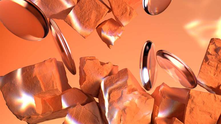
“This vibrant and balanced shade is uplifting and intense and embodies an approach that speaks to health and well-being. Embracing the natural benefits of apricots and oranges (rich in vitamins and antioxidants), the color is also inspired by the beauty found in nature. In times of so much uncertainty, Apricot Crush continues to confirm its importance, acting as a color full of hope and positivity,” informed the company.
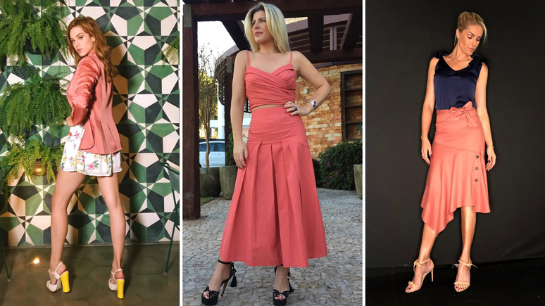
#adic pussy: To find out what the best shade of a color is For you, place the fabrics close to your face and notice which makes it come to life the most.
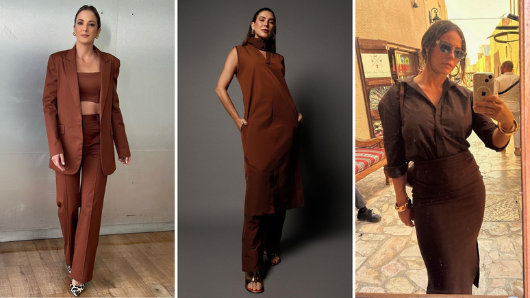
Intense rust
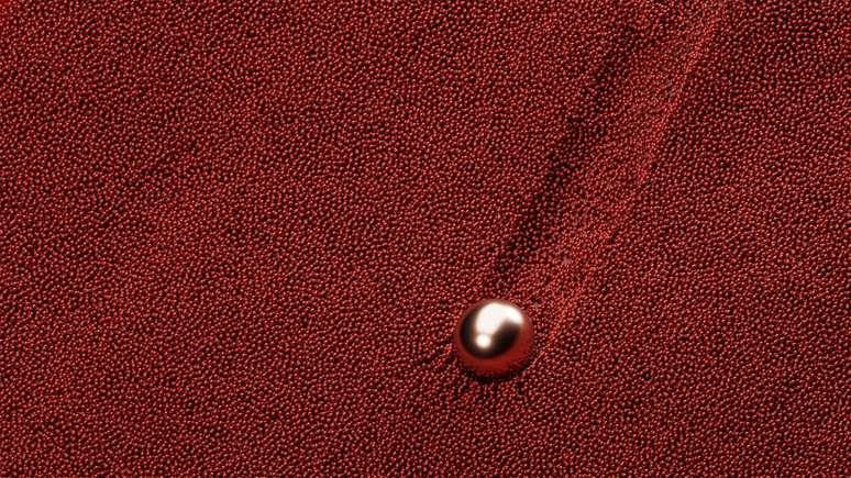
“This warm, rich shade is a timeless brown that evokes a sense of stability. Balancing luxury with a rustic, earthy feel, this color is reminiscent of the earth, full of warmth and soothing textures. This color communicates authenticity, understated luxury and promotes the return of classic design.”
Midnight plum
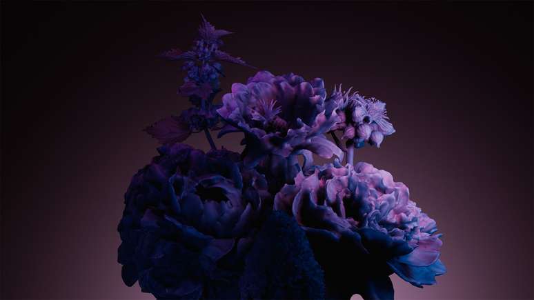
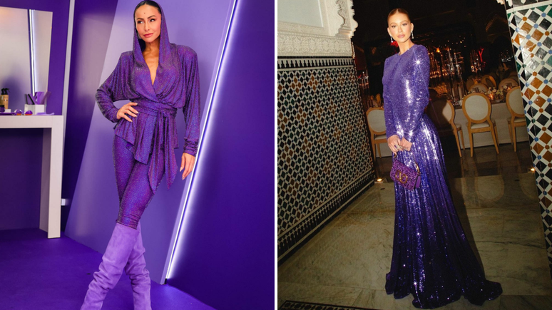
Midnight Plum ties into the themes of space exploration and the metaverse. “It is a dark shade close to black, which celebrates darkness and connects to a sense of mystery, as well as gothic and subterranean feelings. The color aligns with the consumer’s growing desire for escapism.”
Strong grey
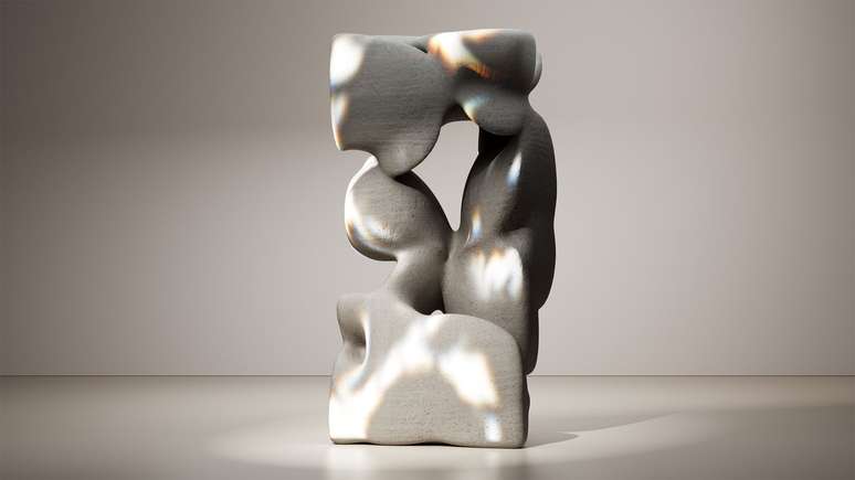
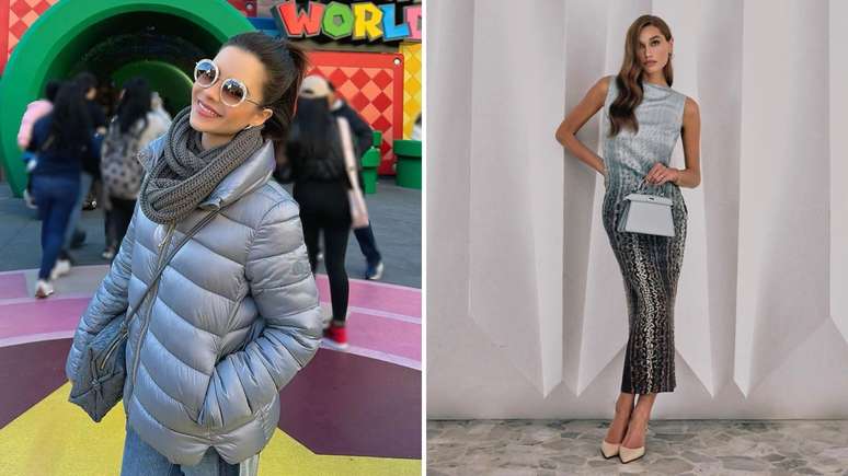
The grey, called Sustain Grey, confirms the importance of neutral colours. “Representing practicality and reliability, this color is basic and elemental with a utilitarian feel. Its purpose is to promote balance and slow down, as a timeless tone with long-term appeal.”
Fantastic matcha
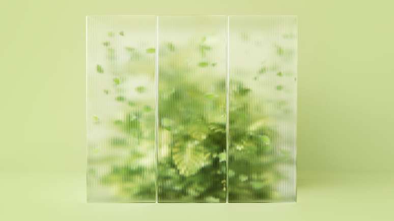
Cool Matcha is a pastel shade of green. “As consumers continue to face feelings of anxiety and stress, we are looking for colors that help calm the mind and bring a sense of rest and reflection. Cool Matcha is a calming and peaceful pale shade with therapeutic properties, as well as being the perfect combination between a vegetal green and a conscious pastel tone.”

Source: Terra
Ben Stock is a lifestyle journalist and author at Gossipify. He writes about topics such as health, wellness, travel, food and home decor. He provides practical advice and inspiration to improve well-being, keeps readers up to date with latest lifestyle news and trends, known for his engaging writing style, in-depth analysis and unique perspectives.


