Discover how a unified palette can enhance any space
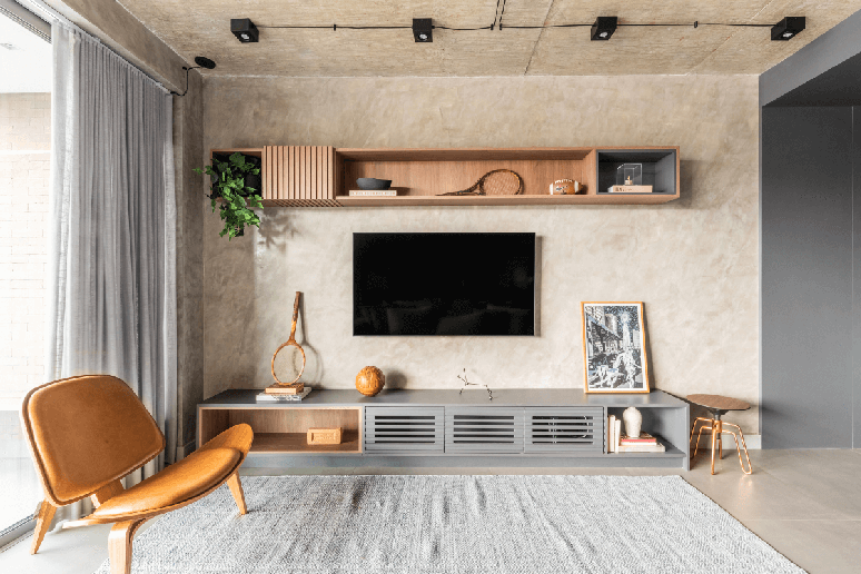
Monochromatic decoration reveals the power of colors when applied with intention and balance. Working within the same palette allows you to create engaging environments, where each nuance has a specific role in building the atmosphere. Far from being synonymous with monotony, this approach highlights textures, materials and subtle contrasts, giving life to harmonious compositions full of personality.
For architect Bruno Moraes, head of BMA Studio, monochrome is a versatile resource and translates both into delicate compositions and into surprising and impactful proposals. According to him, everything depends on the intention and the secret lies in how the nuances are explored.
“Monochrome should not be understood as a limit, but as an opportunity. It invites the gaze to delve deeper into the small variations and details that, in a project multicoloredthey might go unnoticed,” he says.
Next, check out 4 tips to avoid making mistakes with monochromatic decor!
1. Set the colors

The first step is to define which color will be the basis of the environment, and then develop the range of variations ranging from the softest to the deepest. This gradation keeps the design from appearing superficial, adds layers of interest, and balances the intensity. “Those who opt for green can mix soft shades on the walls and opt for more intense versions on the furniture”, explains Bruno Moraes.
Another important aspect is choice materials that will make up this chosen palette. Monochrome only takes shape when inserted into different surfaces such as fabrics, floors, coverings and decorative accessories.
“Monochromatic is much more a question of harmony than repetition. Therefore, playing with finishes, brightness and opacity is a way to enrich the environment without breaking the unity. It is possible to have a matt painted wall, aligned with a lacquered piece of furniture, both of the same color, but with completely different results”, explains the professional.
2. Painting and carpentry

For Bruno Moraes, painting is undoubtedly the most accessible tool to start monochrome. A wall covered in a more closed tone can become the anchoring point of the palette, while the others receive softer variations. This strategy is particularly effective in living spaces such as living rooms and TV rooms, as it creates contrast without introducing new colors.
But designed joinery also deserves its strong point: furniture such as sofas, librariescontainers and panels can be covered in the same chosen palette, reinforcing the sensation of continuity. In kitchens, for example, furniture in shades of grey, combined with appliances of the same color range, create a sophisticated and integrated space. In the bedrooms, the headboard and wardrobe designed in coordinated tones give uniformity without losing comfort.
“The designed carpentry is an ally, because it allows you to explore color in a controlled and functional way”, adds the architect.
3. Textures in the composition

In addition to finishes, fabrics such as velvet, linen and cotton, even within the same palette, produce tactile and visual contrasts that elevate the environment. “Even when we use a neutral palette, for example white or grey, textures can bring complexity to the space. What makes the difference is not the color itself, but how much we can explore its variation in different materials, fabrics and finishes,” he says.
4. Monochrome in different scales

One of the biggest advantages of this style is its adaptability to small and large properties. Us apartments compact, the visual continuity given by a single color helps to broaden the perception of space. Avoiding striking contrasts, the eye wanders around the room seamlessly, making it appear larger than it actually is.
In projects with more generous surfaces, monochrome is a resource that enhances their grandeur. A life with double height ceilings, it benefits from a unique palette that gives unity to the large area and makes the place more sophisticated. However, the choice must be aligned with the desired impact, as neutral colors convey serenity, while more evocative tones highlight the grandeur of the space.
“Monochromatic adapts to the size of the property. In small ones, it is a solution to integrate and expand; in large ones, it is a strategy to provide coherence and elegance. This is why this resource is never limited to a specific project profile”, explains the professional.
5. Overcome fear
Many residents are afraid of opting for monochromatic decor because they think they could easily tire of the choice. A practical alternative is to start in less frequently used environments. These spaces allow you to experience the aesthetics on a smaller scale and understand how monochrome affects the atmosphere.
Another way to reduce insecurity is to introduce the palette on neutral bases and vary the intensity in the accessories. For example, using gray on walls and furniture and including pillows, rugs or artwork in that color.
By Emilie Guimarães
Source: Terra
Ben Stock is a lifestyle journalist and author at Gossipify. He writes about topics such as health, wellness, travel, food and home decor. He provides practical advice and inspiration to improve well-being, keeps readers up to date with latest lifestyle news and trends, known for his engaging writing style, in-depth analysis and unique perspectives.


