As the end of the year approaches, the trends for 2023 have already started to show. Discover the trendy colors for next year
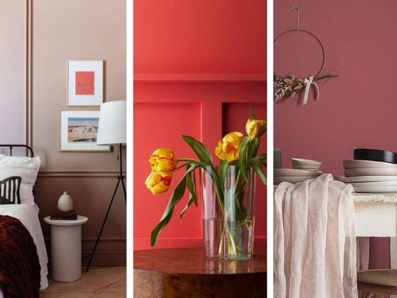
We’re almost at the end of the year, and that means next year’s decorating trends are already here! Some companies have already revealed their Colors of the Year 2023. Considering what we have seen so far, the direction of the color palettes seems to point towards warm earth tones, inspired by natural elements.
Curious? Check here which shades have been released and get inspired for next year’s decor:
Pantone: Long live Magenta
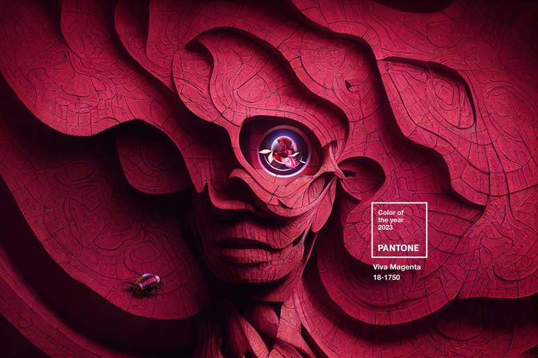
This year the brand has chosen an intense pink shade as Color of the Year 2023. Surprisingly, Viva Magenta presents itself as a reflection of the “unconventional times” we live in. The idea is to bring inspiration and enthusiasm after such difficult years.
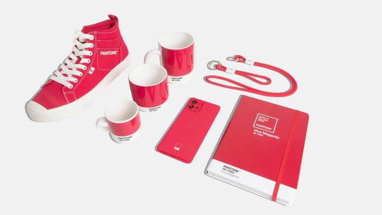
“Bold, vibrant and inclusive of all, Pantone 18-1750 Viva Magenta welcomes one and all with the same rebellious spirit,” the brand said.

Already very present in fashion and make-up (it reminds me a lot of blush!), the pink of pantones promises stylistic trends also in decoration.
Sherwin-Williams: Redend Point (“red end point”, in free translation)
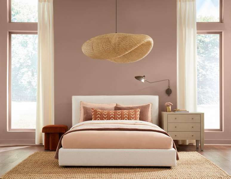
A mix between pink and brown, this beige shade evokes the comforting feeling of earthy colors. Neutral and delicate, the color is quite versatile and promises to bring plenty of warmth.
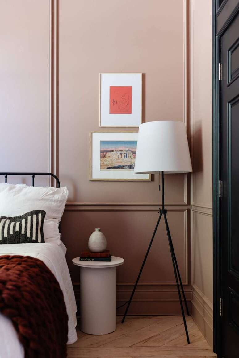
“People have been drawn to earthy, nature-inspired tones for the past couple of years, and that’s something that will continue into 2023 and beyond,” says Sue Wadden, director of color marketing at Sherwin-Williams. “Greens, blues, and browns can make any space feel safe, calming, and grounded but still energetic.”
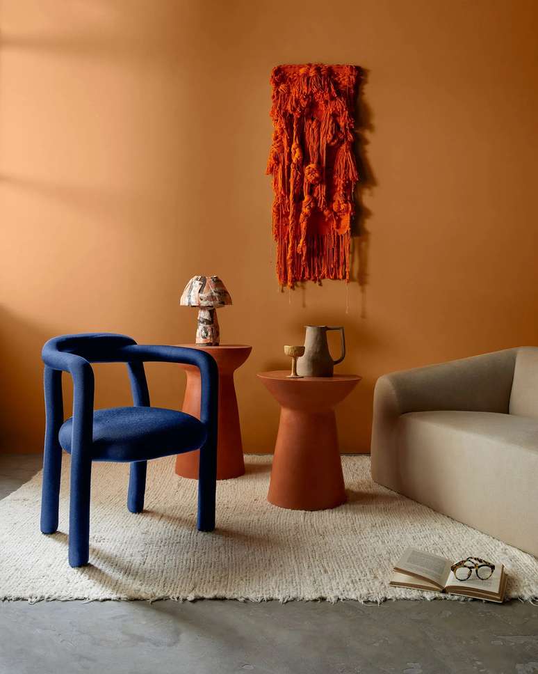
Dunn-Edwards: Terra Rosa
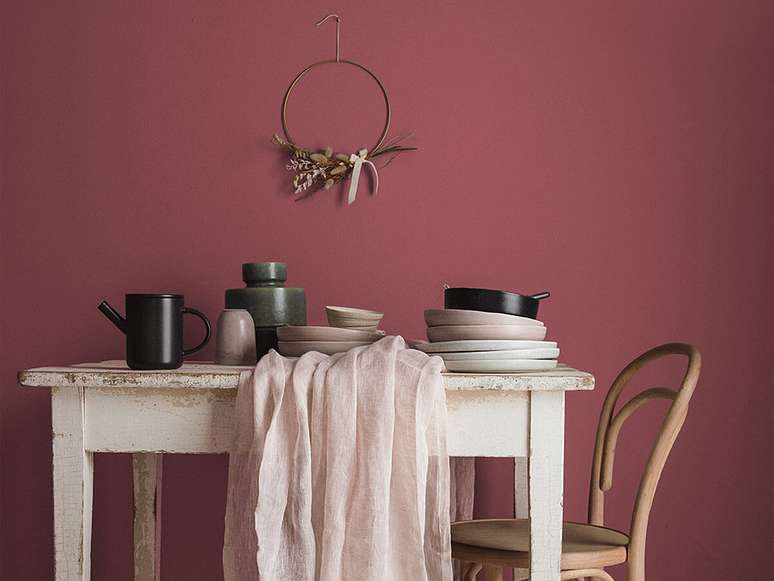
More intense than Redend Point, the Terra Rosa tone brings a deeper touch of pink, similar to wine. This color will surely warm up the rooms with a touch of rusticity.
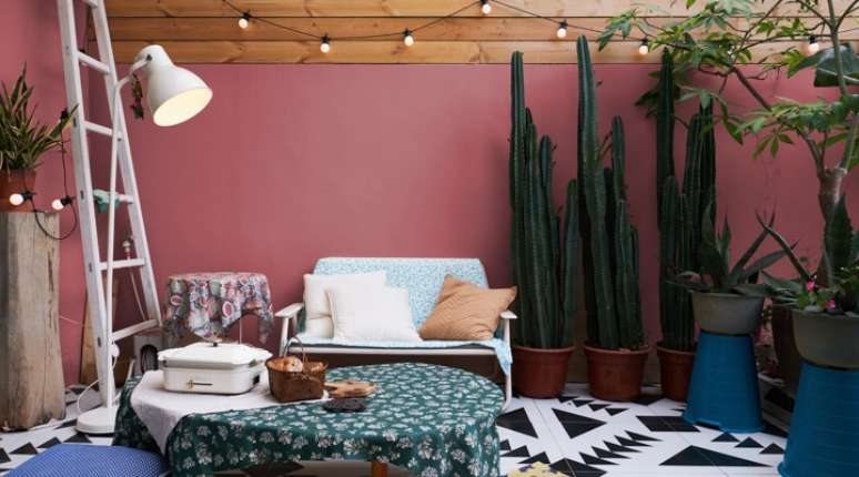
The brand describes it as “a deep rosy shade with a touch of terracotta that exudes confidence, creativity and warmth. Reflecting just the right amount of introspection, this cinnamon-pink shade is strong yet approachable and serves as an updated and refreshing neutral for browns and burgundies. “
Benjamin Moore: raspberry blush (raspberry blush)
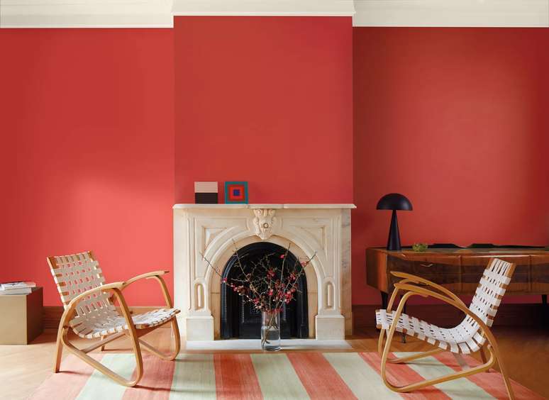
Vibrant and cheerful, Raspberry Blush is featured by Benjamin Moore as “a vibrant shade of pink-tinged coral, Blush enlivens the senses with electric optimism.” Of the tones revealed thus far, this one is the liveliest – it even has a playlist on Spotify!
For those looking for strength in 2023 and wanting to be daring in furnishing, this color will bring optimism to your projects.
Chorus: Winter silence
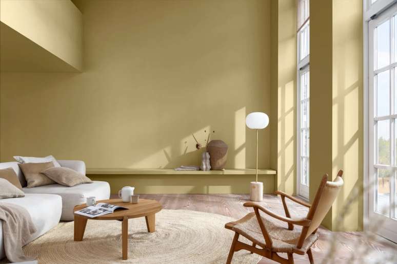
Exuding tranquility, the color Winter Silence seeks to bring positivity through contact with nature. The inspiration came from the concept of transformation, represented by the seed.
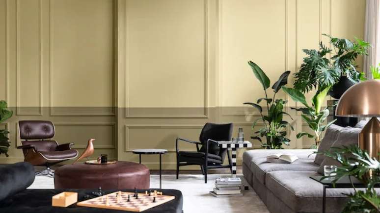
Second Akzo Nobel, the name “silence” evokes the fullness of nature and “winter” conveys the magic present in its transformations. They describe it as “a positive and natural color that, by connecting us with nature, makes our home more welcoming”.
Source: Terra
Ben Stock is a lifestyle journalist and author at Gossipify. He writes about topics such as health, wellness, travel, food and home decor. He provides practical advice and inspiration to improve well-being, keeps readers up to date with latest lifestyle news and trends, known for his engaging writing style, in-depth analysis and unique perspectives.

