Learn about the most beautiful shades of each decade and how to update them in today’s décor
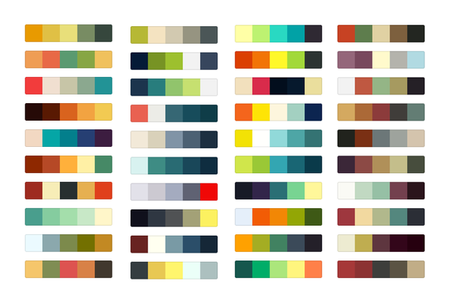
Each decade is characterized by its own set of trends and color palettes – after all, don’t you remember when millennial pink was all the rage just a few years ago?
When you imagine your childhood home (or that of your grandparents), you remember a avocado refrigerator or salmon bathroom tile does it immediately come to your mind? Well, that’s because colors like these tell a story and reflect specific moments in time.
And now, get ready for another trip down memory lane, because here we’ve rounded up the dominant shades of the past century and tips on how to wear some of these popular palettes from decades past without looking dated. Did you like the idea? Find out all below:
1920: Neutrals inspired by nature
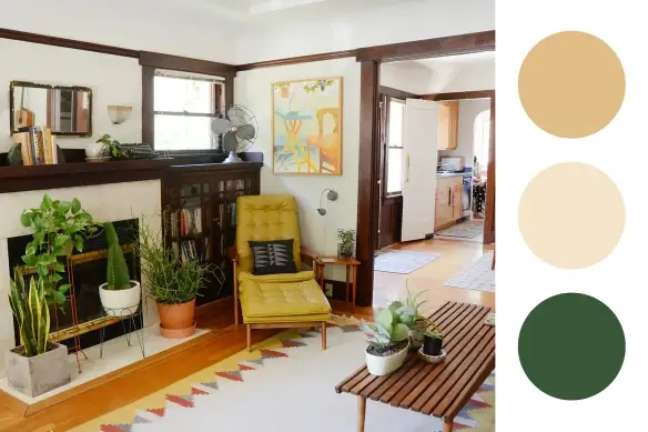
Greens, beiges and creams dazzled the bungalows and artisan houses of the 1920s.
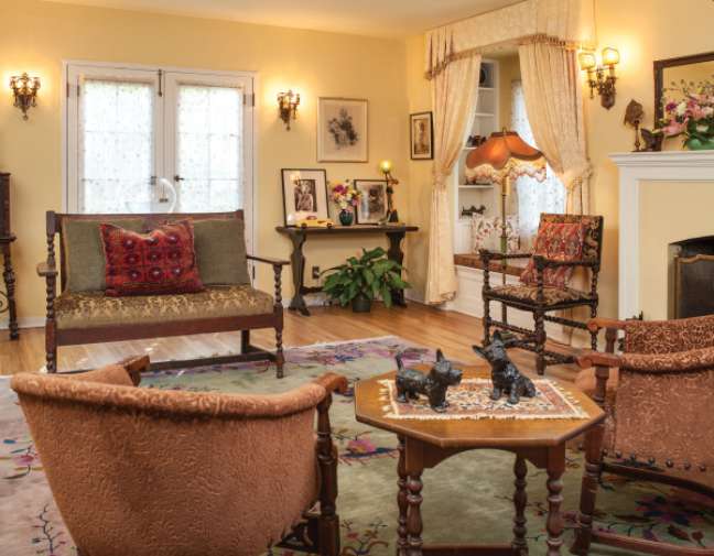
“This was a time when society felt very free and people were exploring fashion in a whole new way,” says designer Philip Thomas Vanderford of Studio Thomas James.
Think less about formalities and more embrace things in their natural state.
1930: Art Deco jewel tones
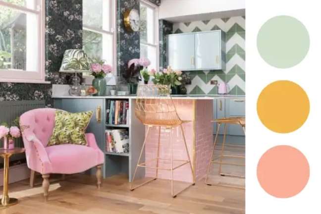
Art Deco landmarks, including the Chrysler Building and Empire State Building, made their debut in the 1930s and shades of art deco style jewelry – such as reds, yellows and turquoise blues – were featured alongside metallic accents.
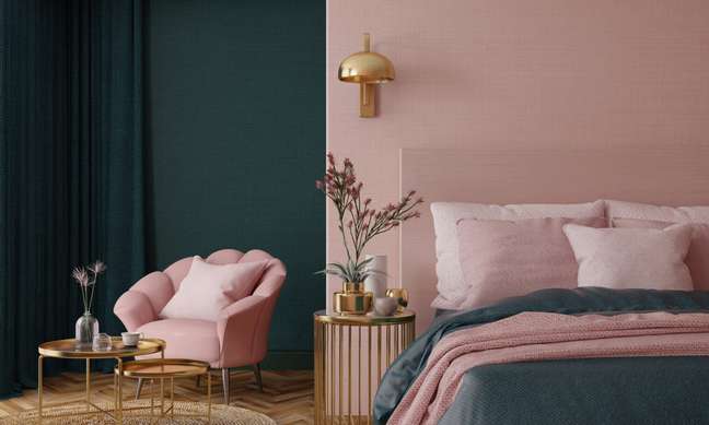
“I think the black and silver details of this era are heavily influenced by this industrial era,” says designer Bryan Yates of Yates Desygn. “The 1930s were also a time of great difficulty for many, and the bold tones of that era seem almost rebellious.”
1940: Modern and simple tones
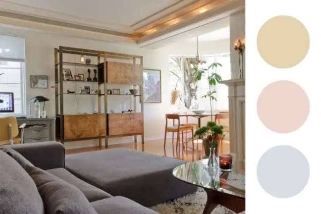
Whites, creams, and dusty pastels were important when World War II finally came to an end.
“I think the decade’s muted color palette is reflected The peace and serenity that everyone has finally heard, “says Yates. On the other hand, perhaps the aesthetic was simply a reaction to the boldness of the previous decade.
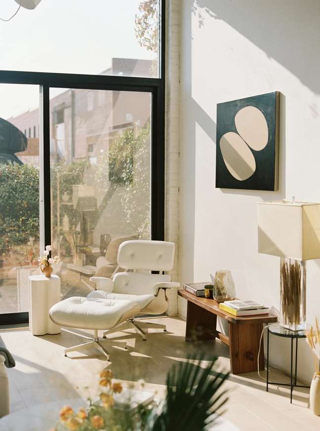
“Whenever society or style goes strongly in one direction, as we saw with jewel tones in the 1930s, the pendulum always swings in the other direction,” comments Vanderford. “This was a time when society started exploring more modern forms of architecture and the war required everyone to become more efficient.”
1950: Sweet pastry
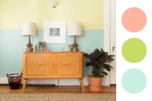
Candy Colors were all the rage in the 1950s, and like pastels pink, turquoise and oliveburst onto the scene with all his might in homes and businesses – even kitchen utensils entered this colorful action.
Designer Annie Elliott of Annie Elliott Design says a dark shade can also help ground these sweet colors and make them more current.
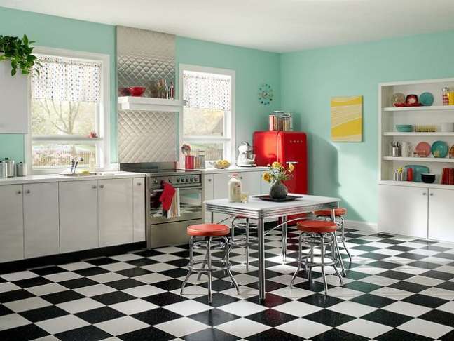
“For example, light turquoise is great with chocolate brown or red, and pink is always great with dark olive green,” he notes. Alternatively, she considers pairing these shades with a bold white. As Elliott says, “Using less color and more white makes pastels fresh and new.”
1960: Groovy Mid-Mod Toni
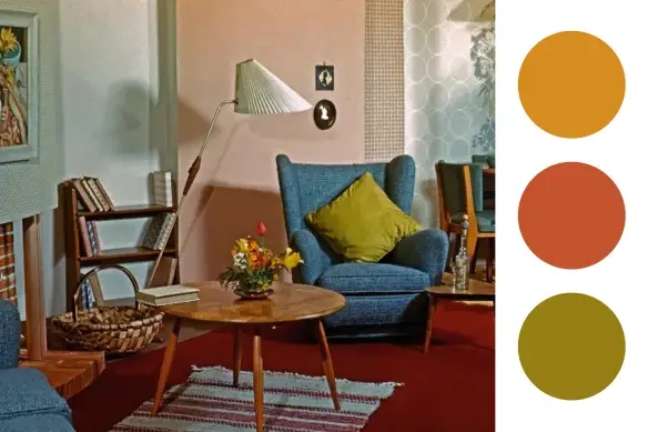
psychedelic colors how green, black and white avocado extended beyond the fashion world in the 1960s; they also appeared on walls, furniture and textiles. If you like colors but don’t like fluorescents, simply “dim the brightness slightly,” advises Elliott. “You will be surprised at how many colors you can use.”
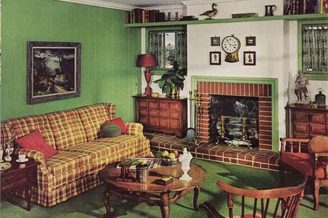
Alternatively, keep your goods and furniture neutral and opt for vibrant details is another viable and contemporary approach.
1970: Neutrals to Earth
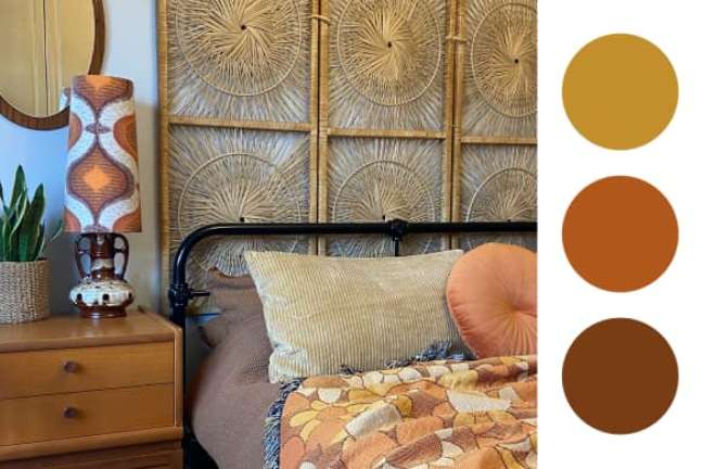
Gold, mustard, rust, pumpkin and others earthy browns they arrived in the houses of the 1970s, where, after the Vietnam War, they also claimed them domestic appliances such as refrigerators and installed accessories, such as bathroom floor and tiles.
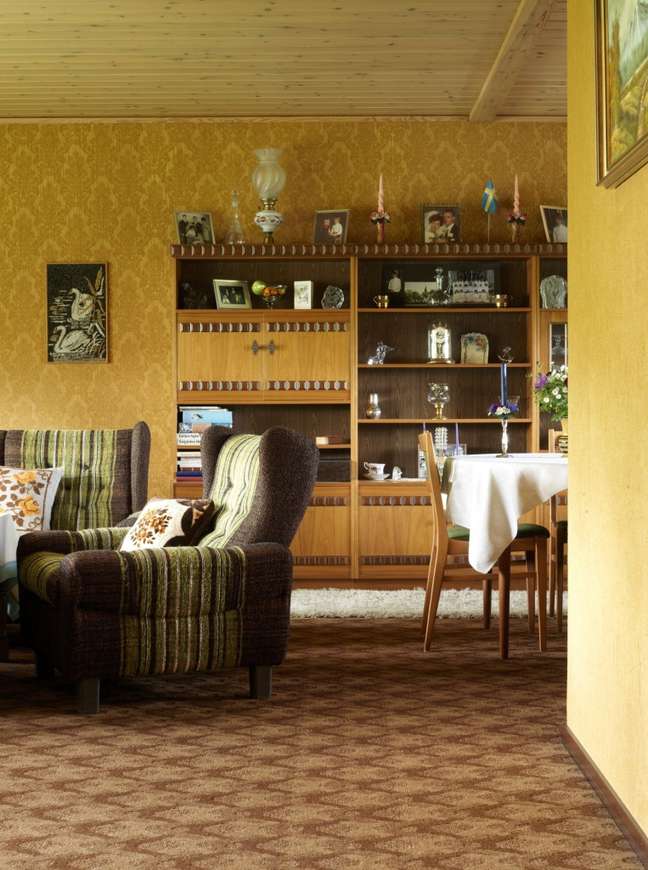
“Although the psychedelic colors of the 1960s were fun and crisp, what people really needed was a home that represented calm and relaxation,” notes designer Malka Helft of Think Chic Interiors. The plastic details, which caused a sensation in the 1960s, were no longer new, so “people were ready to go back to nature,” adds Helft.
1980: postmodern primary colors
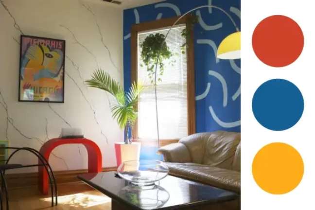
The 1980s were, in part, characterized by Memphis-inspired blues, yellows and reds, as well as a bevy of neon hues. “Design followed the social changes of the time with a greater acceptance of unconventional and incompatible elements that came together to create a concept of cohesive design“says designer and color expert Kristin Bartone of Bartone Interiors.
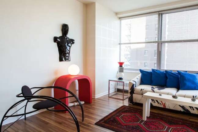
Bartone believes that strong primary colors are always in fashion and you can get used to them painted furniture or how upholstery options. “People still want that ‘shake’, but in smaller pieces,” says color expert and textile designer Lori Weitzner.
1990: Beautiful beige
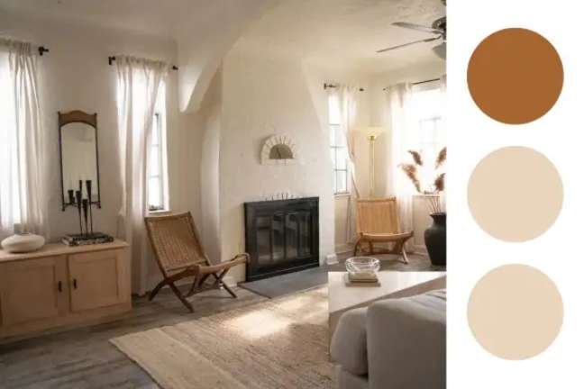
The 90s were all about Tuscan colors: beige, sage, terracotta and earthy reds, which marks a strong contrast with the vigor of the previous decade. “The McMansion have arrived – and with them, the desire for rustic elegance and the neutral and natural colors of the Italian countryside “, explains Weitzner.
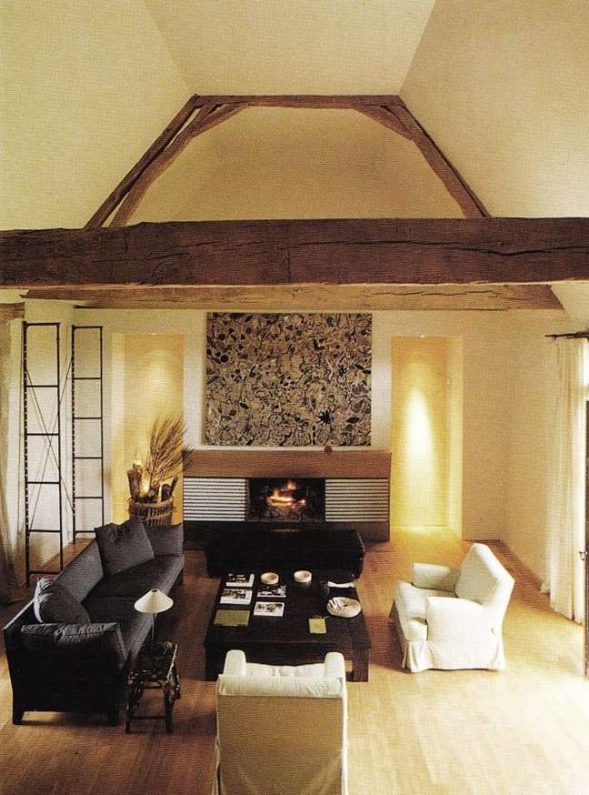
Today, Bartone continues to incorporate these tones into the serene spaces of his design, including the bedrooms and bathrooms. “These earth tones are soothing and calming and can be used on a variety of materials,” he says. “I love seeing them in yours natural state of materialitysuch as natural stone floors or granite countertops. “
2000s: brown and blue
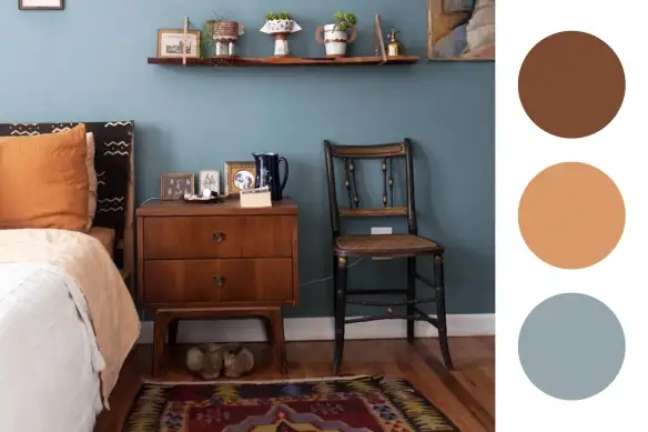
Spa and holiday-inspired blues were ubiquitous in the 2000s, as beiges began to give way to darker browns. Brown wood finishes are still in vogue today, notes designer Layton Campbell of JLayton Interiors.
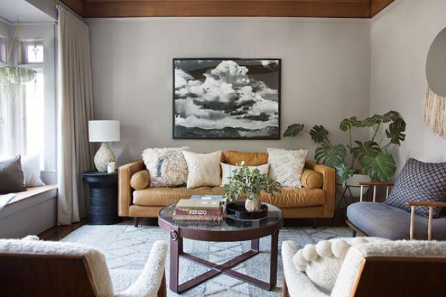
“Consider a spa blue for a linen or bouclé fabric, adding texture but with easy and playful colors.”
Annie Sloan, paint and color expert and creator of Chalk Paint, suggests incorporating these shades along with what she calls a shade. ” disruptive“- think bright pink, vibrant orange or bright green.
2010: The golden age of gray
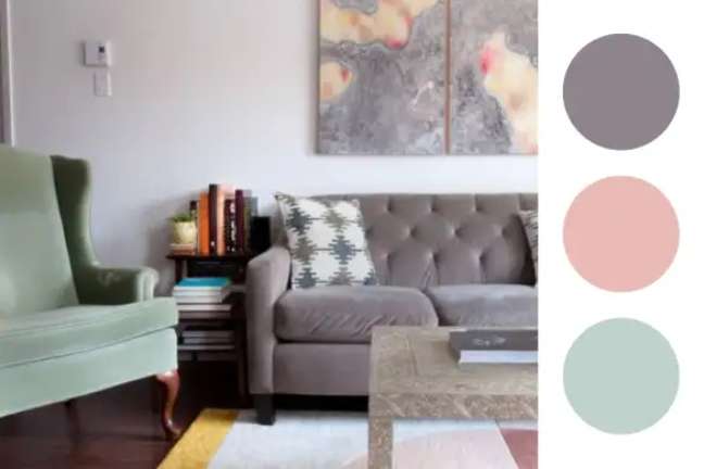
Gray was the name of the game in the early 2010s. But towards the end of the decade, things started to lighten, with the appearance of mint and pink tones. Gray appeared as a alternative to beige tones since the 1990s, explains designer Sara Hillery of Sara Hillery Interior Design.
“When designers and consumers appreciated the comfort of beige, they started looking for something more variety“, she says.
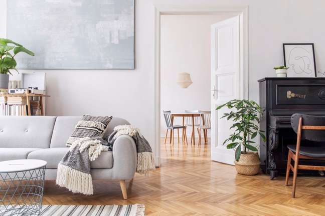
Gray can look good in both modern and traditional spaces, says designer Ahmad AbouZanat of PROJECT AZ. “Try a monochromatic look with various shades of gray or go for warmer shades,” he suggests.
AbouZanat also likes to use gray like Background allowing accent colors to shine through. LH designer Linda Hayslett uses grays with mint and pink in her designs, to this day.
* Via Terapia Apartment
Source: Terra
Benjamin Smith is a fashion journalist and author at Gossipify, known for his coverage of the latest fashion trends and industry insights. He writes about clothing, shoes, accessories, and runway shows, providing in-depth analysis and unique perspectives. He’s respected for his ability to spot emerging designers and trends, and for providing practical fashion advice to readers.

